


Do you know the colors that increase sales for your business?
Choosing the right shades for your brand website, logo, and other assets isn’t just about making your business look good. Psychological study proves that certain colors have an emotional impact on your audience. More importantly, these shades can even influence customer actions, meaning they’re more likely to buy from you.
According to Neil Patel, world-famous branding expert: If the right colors are used, and you send the right message to your target audience, you get fewer objections to the purchase. Crucially, colors that are proven to boost sales even work on premium or higher-priced items.
Unfortunately, finding the ideal colors to use for your business is easier said than done. People can respond to colors in different ways depending on their background. There are some shades that work naturally with some industries more than others.
Let’s explore the basics on how to choose your brand color.
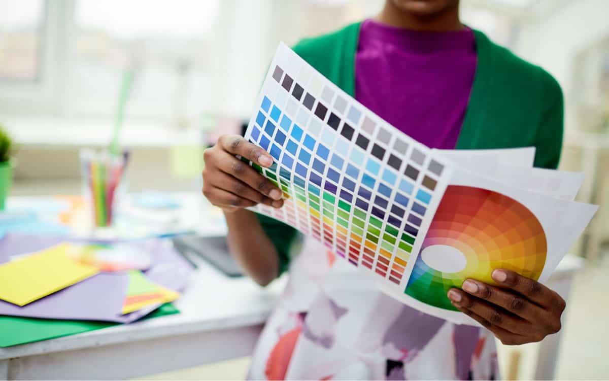
Color Psychology: What Emotions Do Certain Colors Trigger?
A study by Satyendra Singh showed that most shoppers make an initial judgement about a website or product within 90 seconds. Around 62-90% of that judgement comes from color alone.
Think about how you feel when you see a red sign compared to a blue one. The emotional impact of colors that increase sales comes from a variety of factors, including human biology. One study found that in early human history, human beings built associations with colors based on hunter-gatherer activities. Female brains developed to home in on edible fruits through foliage, which may indicate why reddish and pink colors are most popular with women.

Color preferences are also linked to something called the ecological valence theory, which explains that the more positive associations we have with a shade, the better we feel about it. Many of us have positive associations with clear water and skies, so we find blue soothing.
When you’re trying to amplify your message using color, it’s important to think about the science of color psychology, and how different factors might affect your customer’s response to certain shades. Context has an influence on color perception (Such as yellow that can be bright and sunny, or hazardous in a lab situation). Experience and culture also influence color preference. White is linked with death and mourning in Asian cultures, while it means purity in the West.

How Brands Use Colors To Enhance Their Identities
Learning the basics of color psychology does more than just make your products or business look better. It also improves brand recognition. Research shows a signature color leads to an up to 80% increase in a customer’s brand recall. Here are some examples or companies using colors that increase sales.

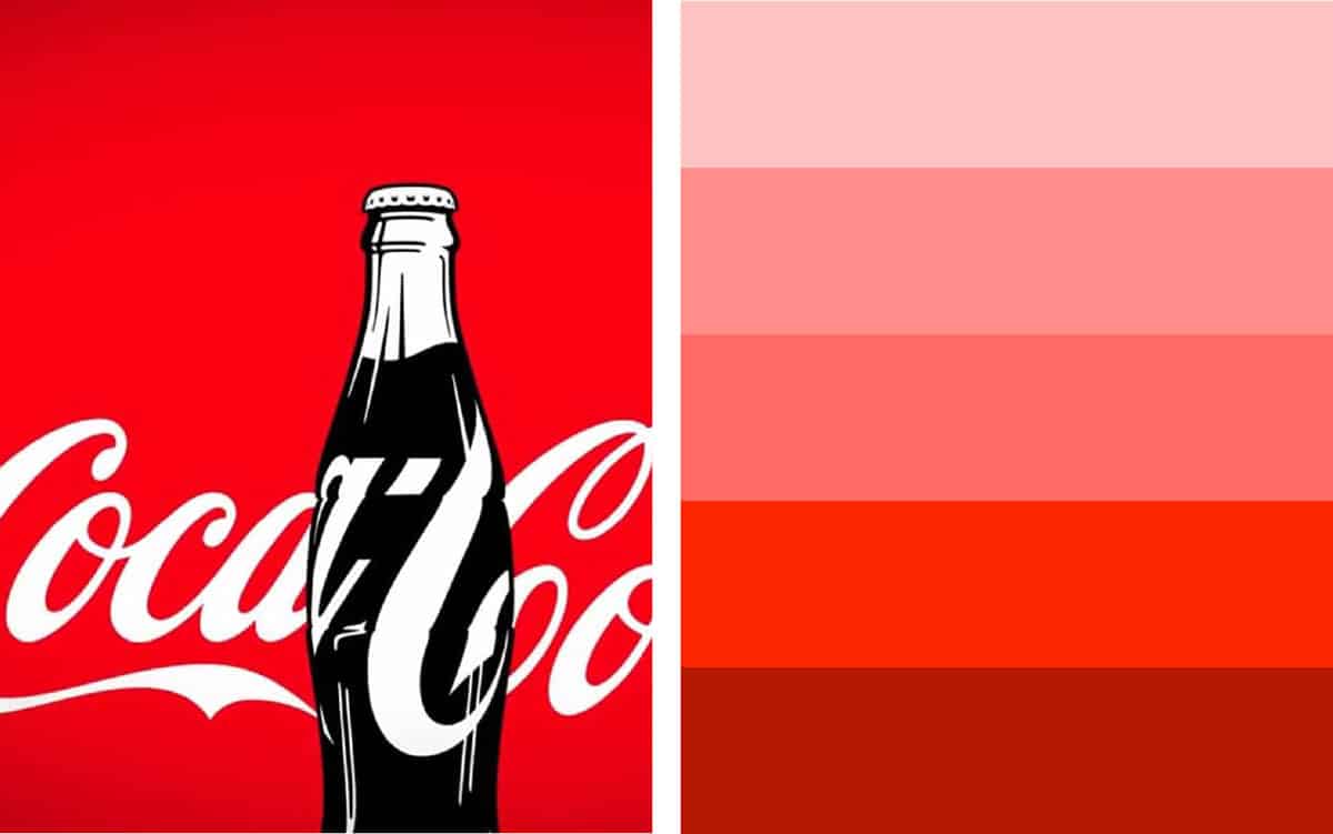
Red
Red is a color often associated with excitement, urgency, and passion. It also boosts feelings of fun and hunger, which is why we see so much red in the food and beverage landscape. Just look at McDonalds, KFC, and Coca-Cola. Shades of red are warm and inviting, but they can also come across as aggressive in some cases.
If you’re looking specifically for colors that are proven to boost sales temporarily, red is great for drawing attention to sales and discounts. It’s an impulsive color that encourages action, and it’s great for announcements and notifications.
Blue
Blue is the most popular color in the world. This shade appears in 33% of the world’s top 100 brands, ranging all the way from Facebook to the Ford motor company. Unlike red, which conveys ideas of urgency, blue is all about reassurance and trust. It stands out as a great color for a background on a website and can help to make a business appear more professional.
Different types of blue can create unique feelings. Light blues create a sense of freedom and security, making them a good choice for banks and tech companies. Darker blues deliver a sense of intelligence and tradition.

Green
Green elicits a sense of goodwill, health, and environmental friendliness. If you want to amplify your message using color, green is a good choice for outdoor brands, or companies dealing with health and wellness. Green also ranks well in the financial landscape, as it’s often connected with money.
Softer greenish blues are great for linking your business to the outdoors, but green can also be a dangerous shade to use if you’re in the food industry, depending on how bright the color is. Unnatural greens are often less appealing in this care

Purple
Purple is all about privilege and wealth when it comes to choosing colors that increase sales. Often connected with royalty, purple is a great shade for a banking company, or a brand that wants to create an essence of luxury. Purple gives your marketing assets a touch of prestige and elegance, but it can also seem “feminine” in softer shades.
Add gold to purple to enhance the sense of prestige in your brand logo or visual assets and be cautious about how much of this bold shade you place on your website. Brighter and richer colors often work better when paired with neutral shades.

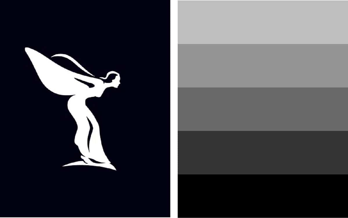
Black and white
Black and white are some of the most versatile colors for branding. They’re often associated with clarity and professionalism. These shades convey a sense of power and strength, with no extra colors to pull your customer’s attention away.
Black and white are popular among luxury brands, but they can also be useful in the technology landscape and electronic devices market. When using lots of black and white on your website, consider using slight bursts of color in buttons and links to draw attention. The Rolls Royce logo in black and white serif text is an excellent example of how these shades demonstrate heritage.
Orange
Orange is a color associated with feelings of energy and vibrancy. This shade can be warm and powerful, making it excellent for grabbing attention. Orange is a little overwhelming in large amounts, but it can symbolize passion, originality, and freshness too. The shade works well with other bright and passionate colors like yellow and red.
If red seems like too much of a harsh shade for your CTA (Call to action) buttons, then orange is a good alternative. You can also use this color as a component of your logo with neutral shades, like the Penguin Books brand does.

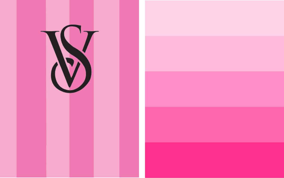
Pink
Most people associate pink with femininity and women. This shade also has valuable links to feelings of romance, love, gentleness, and kindheartedness. Although pink does appeal to males in various parts of the world, it’s more likely to appear in brands that want to reach women.
If you’re wondering how to choose your brand color and pink appeals to you, think about some of the defining features of your brand. Are you fun and frivolous, or hoping to attract the attention of young women? Brighter shades of pink are more daring, while softer pastel shades are gentle and reassuring. Victoria’s Secret uses a combination to appeal to its diverse audience.
Yellow
Like red and orange, yellow is a warm color linked to playfulness, cheerfulness, and confidence. It works well at grabbing customer attention and creating excitement. Yellow also evokes feeling of hunger and urgency, making it a good choice for food companies, as long as you choose the right shade. Bright shades of yellow and black can convey danger and hazards too.
Combine shades of yellow and orange to create a sense of playfulness that work well in industries like the pet market. Many people also connect the color yellow to light, which makes it a good choice for photography companies like Nikon.

Brown
Brown is a less common color to appear in most branding circles, but it has a lot of value. This earthy tone can create feelings of relaxation and friendliness when used in the correct shades. Warm and quiet colors of brown won’t overwhelm your brand image.
Browns work well with soft and natural colors, like creams and slight off-white shades.A lot of people struggle to get the right shade of brown in their branding, because the color can also be quite unappealing in some circumstances too. If your product already contains the brown color, then you might go in this direction, like the M&M’s brand (chocolate) or a coffee company.

How Colors Affect Behaviour And User Purchases
It may be strange to think that there are colors that are proven to boost sales and improve your interactions with customers. But anything that has an emotional impact on your audience will always influence their purchasing behavior. Harvard studies prove that around 95% of all purchasing decisions are emotional (not logical).
Combined with other important factors like your brand message and personality, your chosen colors will influence how your customers feel about your brand. Those emotions drive your customers to buy products, recommend your brand and keep coming back to you in the future.
According to Neil Patel’s study through Kissmetrics:
- 93% of purchasing decisions are based on visual appearance when customers are presented with new products or services.
- 85% of customers place color as a crucial reason for purchasing a particular product.
- Around 42% of shoppers base their opinion of a website on it’s design. Another 52% of customers say that they didn’t return to a business because of its aesthetics
Color is one of the most powerful methods of branding, but it’s not universal. Colors that appeal in North America are different to the ones that entice shoppers in Asia.
Color also has the ability to attract different kinds of customer. Traditional buyers are more likely to be drawn to clothing shops using colors like pink and sky blue. An impulse shopper, on the other hand, is more likely to appreciate colors like red and orange in fast food outlets and outlet malls. What’s more, one article found that using the color red is more likely to encourage quick buying decisions, while blues trigger more thoughtful decision making.
Because we know that customers make decisions based on their feelings, the most influential factors in encouraging sales may not be the ones that seem the most logical. Learning how to amplify your message using color will help you to encourage the right kind of sales, among the right audience.

Which Colors Are Appropriate For You?
Figuring out how to choose your brand color is a process that requires plenty of thought and research. There are some shades that seem to work better with certain industries. Feminine companies specializing in beauty products, lingerie and similar items are more likely to choose soft shades of pink and purple, because these appeal more to women in the western world.
A lot of factors can influence which colors you use for your business, though, including:
- Location: Different parts of the world have different cultural responses to color. Shades that are popular in the Western world include blue and red. Blue is still a popular choice in Asia, but it’s more likely to be accompanied by purple.
- Brand personality: If you want to amplify your message using color, you should know what that message is. What kind of business do you run? Are you friendly and reassuring? If so, blue might be the color for you. If you want your brand to be loud and energetic, then you may consider reds and oranges instead.
- Audience preference: Use your customer personas to assess the possible preferences of your target audience. If you know you have a largely masculine audience, then you should probably stay away from shades of rose and lavender, more commonly associated with women.
- Competitor analysis: Competitor analysis will give you an insight into which shades work best for other companies in your industry. Just make sure that your brand image still stands out among the other brands in your space. You don’t want to look the same as everyone else.

Using Color Psychology In Your Business
Once you have an idea of the colors that increase sales for your company, make a note of them in your brand guidelines. It’s best to get Pantone and HEX codes for your colors so you can share them with other companies that might work on your brand assets for you.
Having a complete guide to the brand colors you want to use for all of your employees will help you to present a consistent image to your customers in every environment, including your social media pages and on your website. Some of the places you’ll need to use your brand colors include:
- In your logo: Your brand logo should be the ultimate representation of your brand identity; complete with the colors that you want to create an emotional response with.
- On your website: Your site should feature your brand colors but be careful not to overwhelm your audience. Just because your business shade is bright pink doesn’t mean your entire website should be that color. Contrasting shades and plenty of white space are important to make your site look clean and accessible.
- In social media profiles: Adding your brand colors to your social media profiles gives you more consistency online. Adding elements of your chosen shade to each of your picture on Instagram, or the videos you share on Facebook reminds your customers of who they’re dealing with.
- Other visual assets: Implementing your brand colors into visual assets like promotional videos, email marketing templates, and even your store signage all creates a more professional and memorable image.
Aside from using the same colors in your logo, website materials and assets, it’s also worth making sure that you know how to use colors that are proven to boost sales in your marketing campaigns too. The Richdad.com company for financial education products uses orange and yellow buttons to generate excitement and push people to make purchases.
Even if red isn’t a standard part of your brand color system, you might use it when you’re running a sale or offer on your website.
If you start running annual sales or regular offers at certain times every year, then it might be a good idea to use the same shades for your sale banners and announcements. This will let your customers know what to expect. Consistency is key for all aspects of branding.

Amplify Your Message Using Color
Knowing how to use colors that increase sales in your brand assets and marketing campaigns is crucial to standing out in today’s cluttered landscape. Don’t go over the top though. 95% of the top brands in the world only use one or two colors consistently. Simplicity is the key to memorable branding.
Find the shades that work with your brand and use them to connect with your audience in everything that you create, from your logo to your website.


