In today’s digital age, 38% of people stop engaging with a website when the layout or content is unattractive. 46% of customers will base their judgement of a site’s credibility on the website’s appearance, and 94% of customers base their trust of a business on the site’s design.
Great design combined with excellent usability instantly boosts your chances of engaging your audience, and even converting visitors into customers. A captivating design makes your business look more professional, while setting you apart from the competition.
The following list of inspiring website design will give you a glimpse into what great websites should look like.
What Makes The Best B2B Website Design?
The best B2B website design needs to convince buyers they’re working with professionals. When you’re trying to attract customers as a B2B brand, you’re appealing to people under a lot of pressure to make the right decision.
When a consumer makes the wrong purchasing choice, they experience a little regret, and avoid doing the same thing in future. When a business buys the wrong thing, profits can drop, brand reputations can suffer, and people could even lose their job.
Here are some inspiring website design elements to convince your customers of your credibility.
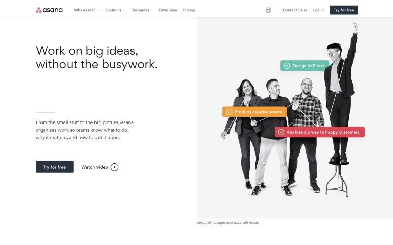
Above-The-Fold Benefits (Asana)
Asana’s website instantly tells buyers what they can expect when they invest in the service. All the crucial information you need is at the top of the fold (before you begin scrolling). There’s a video to show you how the service works, a benefit-focused heading, and CTA that encourages you to try the service for free.
As visitors scroll down the Asana home page, they’ll find more animations, benefit lists, and extra information to help them make a confident decision.
Problem-Focused Promises (Hubspot)
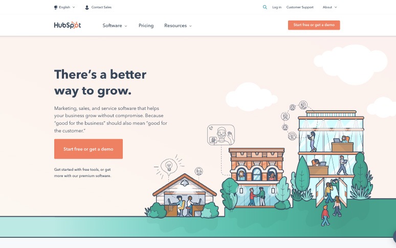
B2B customers are more likely to invest in products that save them money, or prevent mistakes, than they are to seek out new opportunities. Hubspot’s website immediately addresses this fact by promising customers there’s a “better way to grow”.
Like Asana, Hubspot also uses a risk-free call to action to remind their customers they can try the service for free. There’s also plenty of branded illustrations to bring the inspiring website design to life.
A Unique Brand Personality (Salesforce)
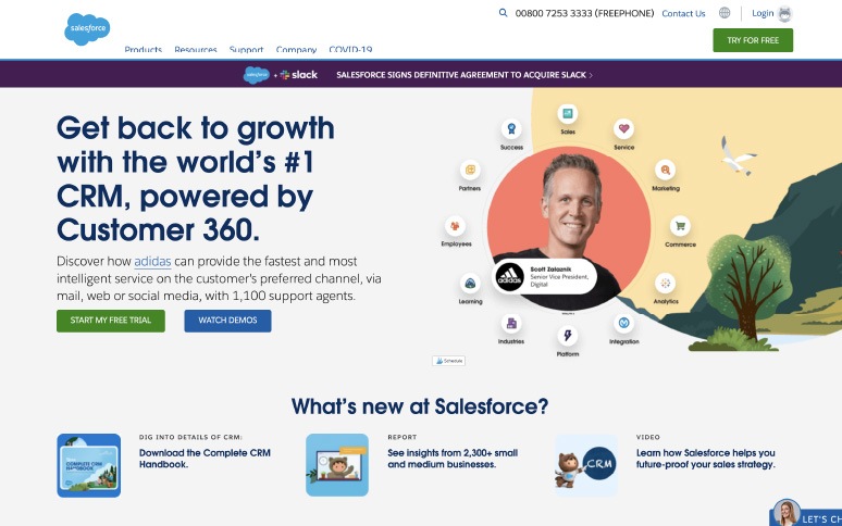
B2C and B2B consumers aren’t entirely different. Although B2B brands often try to make more logic-based decisions, they’re still influenced by their emotions. Adding a unique personality to your website design helps to build a deeper connection with your audience. Salesforce’s unique brand mascots immediately make the website more memorable.
Aside from using playful graphics on their site, Salesforce also includes plenty of graphical data, statistics, and demo videos to give customers the logical information they need too.
Social Proof (Grammarly)
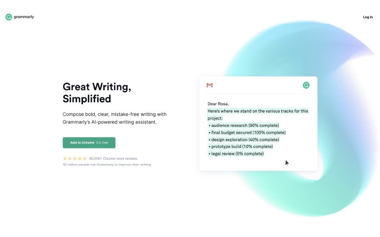
Social proof is crucial to making sales. When you need to earn the trust of B2B companies, testimonials and reviews from other clients make a huge difference. Grammarly, a proof-reading application, shows its credibility from the moment you arrive on the website. There’s a graphic showing more than 30 million people using Grammarly today alongside 34,000 Chrome store reviews.
Grammarly also makes it easy to understand how the service works. There’s a GIF to show you what you’re going to be investing in, and plenty of extra information about where you can use Grammarly, which companies already use it, and so on.
Simplicity (Trello)
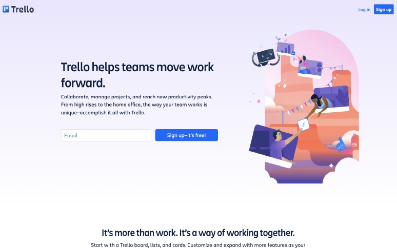
When searching for solutions for business problems, B2B consumers are often looking for the best results in exchange for minimal effort and expense. Trello, a company that helps other businesses manage projects and teams, promises an easy experience from day one. Even signing up is easy. Users just enter their email into the form field on the home page.
When you sign up for your Trello account, the website design also includes multiple sign-in options to save you time. You can create a new account, or continue with a Microsoft, Apple, or Google account you already own.
Helpful Content (Dropbox For Business)
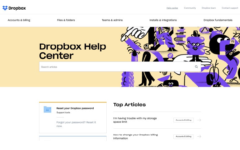
Inspiring website design isn’t just about building a beautiful home page. B2B customers often have a lot of questions they need answered before they’re confident spending money. Dropbox for business streamlines the path to purchase by including an FAQ page to answer any queries.
The FAQ is located on the home page, along with a link to a “Why Dropbox?” page where clients can find extra information about the unique benefits of the product. Because customers can get quick answers to questions themselves, they don’t need to wait from feedback from a service rep.
Unique Visuals (Slack)
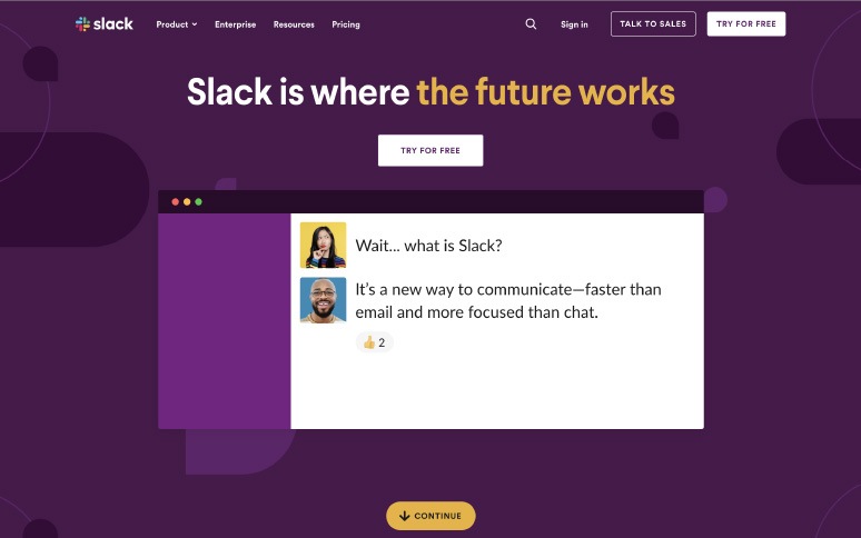
Many of the best B2B web design choices we’ve covered so far have had a fantastic visual appeal. Few are quite as unique as Slack. This website, with its unique parallax scrolling experience, and automatically playing GIFs, is full of iconic branding.
Each graphic serves a purpose by showing you how the product works or helping you to understand the pricing structure. You can even adapt the experience you have on Slack’s website by choosing whether you’re a small business, large enterprise, or mid-sized company.
Intuitive Navigation (WeWork)
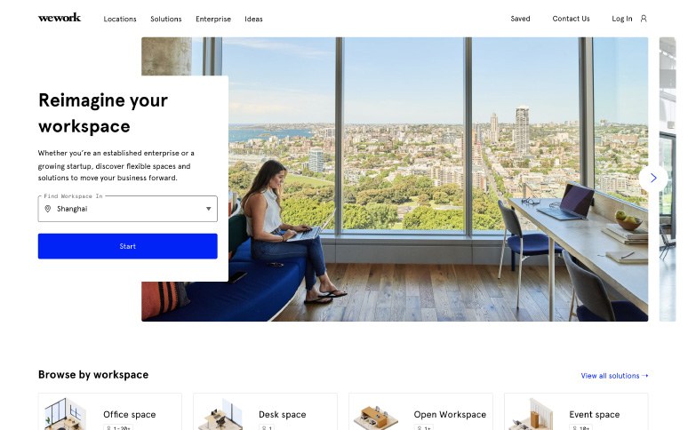
B2B buyers don’t have a lot of time to search through options for the right purchase. They need to gather information about an investment fast and ensure they can sell the service to their stakeholders. Intuitive navigation makes it easier for clients to find the information they need for a quick, convenient purchase. WeWork is a wonderful example of B2B website design navigation. You can search for workspaces on the homepage based on where you live, and filter options based the size of the space you want.
The navigation panel also allows users to save their workspaces to a custom environment where they can come back and look at them later. That’s great for B2B clients who might not be ready to invest immediately.
Eye Catching Offers (Moo)
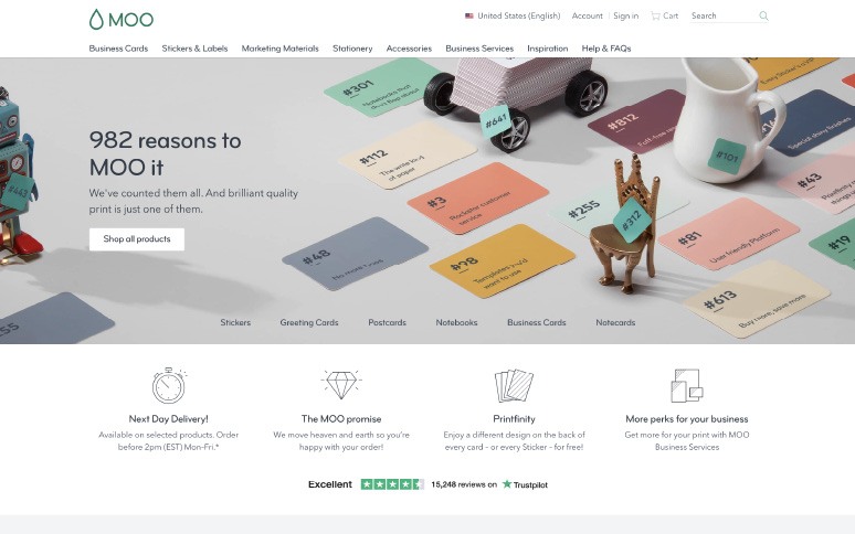
B2B consumers are under a lot more pressure to get their purchase right first-time around. This can often lead to decision paralysis, where business buyers fail to make a purchase, or procrastinate on buying something due to nerves. A quick offer that your clients won’t want to miss out on could keep them on your site for longer and make them want to buy.
Moo offers an instant deal to new buyers with free shipping. The pop-up appears as soon as you arrive on the website, convincing users to act immediately. As you scroll through the site, you find even more benefits to help you buy, like next-day delivery, Moo guarantees and more.
What Makes An Inspiring B2C Website Design?
An inspiring B2C website design can contain many of the elements mentioned above, including an emotional appeal, unique graphics, and intuitive navigation. B2C customers are also more motivated by emotion, making things like entertainment, tone of voice, and visual appeal more crucial.
Here are some elements a great B2C website might include to attract and convert more customers.
Creative Control (Shoenvious)
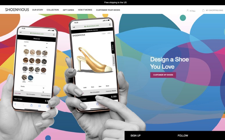
Customers in the B2C market love products that are unique to them. There are tons of people out there happy to pay more for products that they can adjust or alter according to their needs. Often, we buy products as a way of showing off our unique personality and style. There’s no better way to do that than with customization.
The Shoenvious site gives customers complete control over creating the perfect pair of custom shoes. Customers can design the footwear they love with materials, designs, and shapes that mean something to them. It’s a great way to make people feel more invested in what they’re buying.
Vibrant Colors (Poketo)
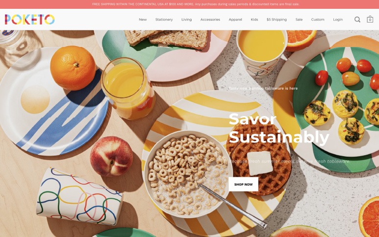
B2C customers are constantly engaged by bright colors and beautiful visuals. When we’re browsing through shelves in a supermarket, we’re more likely to pay attention to the most colorful or dynamic packaging. The same is true for inspiring website design. Poketo uses bright colors and moving images to immediately draw the eye.
By creating a highly visual website, Poketo appeals to customers looking for vibrant, entertaining experiences. Scrolling through the site feels a little like scrolling through Instagram.
Exclusive Offers (Grovemade)
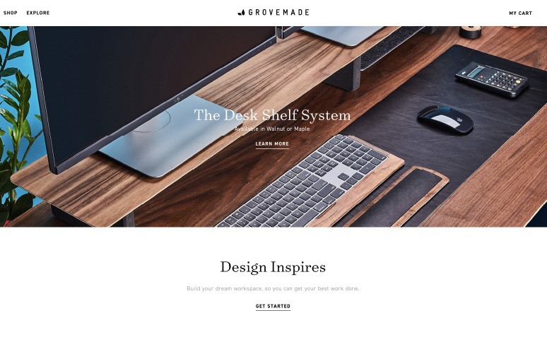
Grovemade’s website design is classy, elegant, and laser-focused on converting customers. As soon as you arrive on the website, the system can define whether you’re a new customer. If you haven’t made a purchase before, you’ll get a pop-up offering 10% off your first order.
Like Poketo, Grovemade also benefits from a vibrant, visual-oriented website design that immediately pulls customer attention.
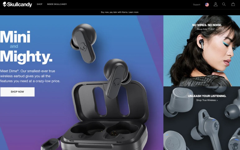
Animation (Skullcandy)
As consumers, our eyes are automatically drawn to things outside of the “ordinary”. If you’re scrolling through a feed on Facebook and you see a video start playing, the motion grabs your attention. The same is true for animations on websites. Skullcandy uses animated clips of its products to earn customer interest and provide information.
Aside from giving you something interesting to look at, the animation on the Skullcandy site also helps you to visualize the product better. It feels like you’re taking the headphones out of the case and checking them out yourself.
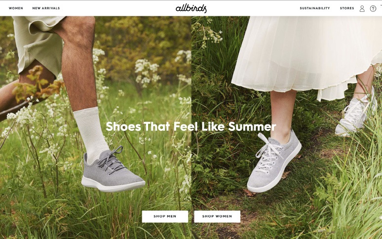
Human Photography (Allbirds)
B2C consumers buy products based on the emotional impact a brand can have on them. Authentic photos and images featuring real people are more likely to connect with us on a human level. We feel connected to the people in the content, and we’re more likely to relate to them. Allbirds uses this strategy throughout its inspiring website design.
Unique photography also ensures that you don’t blend in with the other companies that might be using stock photos in your industry.
