Your website is an essential component of your growing brand.
But what is it for?
Everyone has their own opinions about what a great website should be, but the best examples serve three core objectives. First, your site helps you to share your story with your customers in an emotional and engaging way.
Secondly, your site attracts visitors to your business, giving you a chance to cultivate sales and conversions. Third, your website is the catalyst that turns everyday people into loyal customers.
So, what do you need to make your website successful?
While home pages and about pages share information on what your business does and who you are, you need a different kind of tool to cultivate sales. Studies show that teams capture a higher number of leads by directing them to dedicated landing pages.
A well-designed landing page is the most effective way to generate great opportunities for your business. Let’s find out how to create a landing page that works.
What are Landing Pages?
A website consists of many different components. You’ve got contact pages for people who have questions about your service. Product pages highlight what you have to offer, and checkouts enable the sales process.
A landing page is a unique place in the buyer journey. It’s where your potential customers land when looking for solutions to their problems. Regardless of whether people come to your website from social media, online search, or a guest post, a landing page is the first interaction they have with your company.
Landing pages introduce the benefits of your products or services to customers and convince them to do something. You might ask your audience to sign up for an email campaign, buy an item, or just get in touch for a custom quote.
If you have different audience segments, and various products or services to offer, you may have multiple Landing page designs that convert. The idea is to push your audience in the right direction by giving them a meaningful interaction with your company.

The Benefits of Tailor-Made Landing Pages
So, why bother with high converting landing pages at all?
Your home page can tell people what you have to offer, and customers can easily click around your website to gather more information, right?
Landing pages might seem like extra work at first, but they have distinct features that make them crucial to your marketing and sales strategy.
Campaign-specific landing pages are highly focused. They don’t waste time with promotional material, extra information, and other unnecessary details. These assets immediately present the benefits of your business and show customers what they need to do to access those advantages.
Landing page designs that convert also give you helpful insights into your audience. 52% of the companies and agencies using landing pages today also rely on testing to constantly improve their conversions. Landing pages are special because:
- They contain minimal distractions: Your landing page is free from fluff. There aren’t any flashy links out to other pages, or navigation bars to distract your audience. All a customer gets on a landing page is the offer, and a button to click, or form to fill out.
- They’re simple: Today’s consumers are looking for quick and convenient paths to purchase. They don’t want to waste time on a complex process. Landing pages make it quick and easy for customers to get what they need without having to search through your site.
- They’re highly targeted: A good landing page keeps your target audience in mind. Every page you create will have a user persona to guide it. This ensures that you can speak your customer’s language, share the information that matters most to them, and optimize conversions.
The Essential Components of a Good Landing Page
Now you know the benefits of a good landing page, how do you make your own?
That question isn’t as simple as it seems. The landing page that works for your audience might not be the same as one that works for another company.
Some experts say that shorter landing pages are the key to success. Clear and concise pages provide fewer opportunities for visitors to end up getting distracted. With less real estate to share your message, you’ll need to be extra concise with your copy and graphics.
Other teams believe that long landing pages generate up to 220% more leads than those with above-the-fold call-to-action buttons. The key is testing different strategies for both design and copy to see what works for you.
Design Best Practices
Let’s start with how your landing page looks.
A simple and clean landing page is essential to convey your message effectively. You’ll need to use laser-targeted graphics and copy, with no fluff, and plenty of white space. This makes your content easier to read.
A few tips to consider for a well-designed landing page include:
- Use the fold: It’s best to place less action-focused information below the fold on your landing page. CTA buttons and other actionable elements go above the fold. This means that your heading (main offer) and conversion button is the first thing customers see when they arrive on your page. If they want to learn more, your clients can scroll further down the page.
- Experiment with directional graphics: Directional graphics like arrows and other elements guide customers down the page. This encourages your audience to engage with the right content.
- Stay consistent: Your landing page design needs to visually match any marketing campaigns directing traffic to a landing page. Don’t try to trick someone to click on a link with one offer, then change the deal on the landing page itself.
- Showcase your brand: Remind your audience who they’re dealing with by showing off your logo and brand colors. You don’t want customers to be concerned that they’re dealing with a scammer.
- Keep it simple: Make sure that your audience knows exactly what they need to do from the moment they arrive on your landing page. The path to conversion should be 100% clear. Remove any unnecessary graphics or buttons.
Content Best Practices
It’s not just how your landing page looks that matters to your conversions. Your content also needs to stand out and send the right message.
To start, define what you want to achieve with your landing page. 48% of landing pages contain multiple offers, but this can often lead to confusion for your clients. Stick with a single goal, and you’ll be more likely to guide people in the right direction.
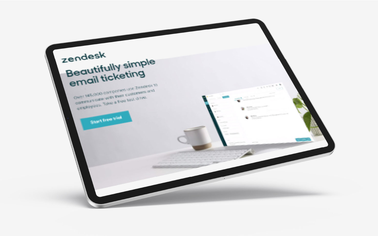
For instance, on this Zendesk landing page, the company wants you to start a free trial. It’s immediately clear what the goal of the page is.
To improve your chances of clicking on the “Start free trial” button, Zendesk uses social proof. The company tells you that over 145,000 companies already trust the app when communicating with employees. Try the following tips for landing page designs that convert:
- Keep it clear and concise: Get straight to the point. Tell your audience what you want them to do and how to do it. Don’t distract your audience with complicated stories.
- Reduce the risk and highlight the benefits: Make the advantages of converting clear, and un-threatening. On the Zendesk page, the word “free” appears twice at the top of the page.
- Put the customer first: Immediately tell your visitor what they’re going to get from you. Focus on benefits, not features. For instance, “Time-saving,” not just “convenient app.”
- Make it simple: Ask for the behavior you want from your audience with clear language. Only ask for one thing at a time – don’t go too far.
- Stay consistent: Match the message from your marketing copy to reinforce the authenticity of your brand. If you promise a free trial, your landing page should be all about that free trial.
5 Top landing page design examples
Landing pages come in a variety of different styles, from the solutions that push customers to sign up for email newsletters, to the options that attempt to drive sales. The following top landing page design examples will inspire you to create your own.
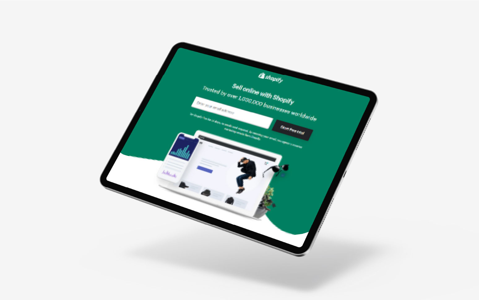
1. Shopify
Shopify, a company offering online selling solutions for retail businesses, keeps things simple. The trial landing page instantly tells you want the company wants you to do “Sign up with Shopify.” The call to action and the request for your information is at the top of the page (above the fold).
Shopify also reduces any worries you might have about risk by letting you know you can try the service for 14 days without using your email address. You will agree to receive marketing emails if you sign up.
Shopify’s well-designed landing page is honest, straightforward, and eye-catching. If you want to learn more, you can scroll down the page for more information on the benefits of signing up.
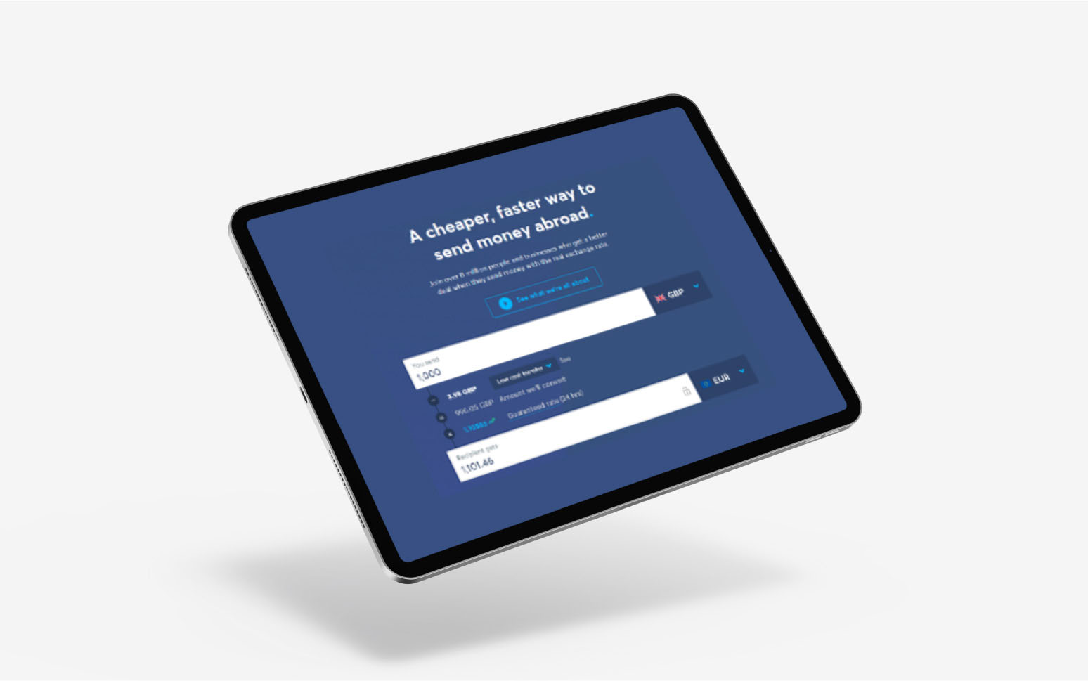
2. TransferWise
TransferWise is a financial company that lets people send and receive money in different currencies. On its landing page, you can see how the service works. TransferWise provides all the information you need about currency options, transfer fees, and conversion rates.
Like other top landing pages, the call to action “See What We’re all about” is at the top of the page. You also get the option to sign up for the service immediately. TransferWise takes a highly informative approach to engaging its audience with this landing page.
Scrolling further down the landing page will show you more information about how transaction fees on TransferWise compare to other companies. The business also answers common questions like, “Is TransferWise safe?”
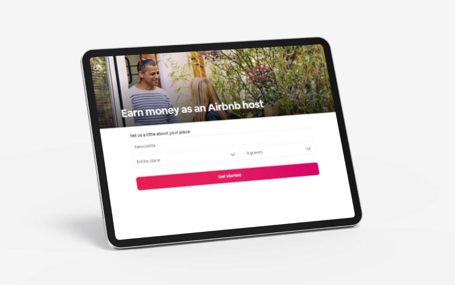
3. Airbnb
Airbnb makes profits from a constant roster of hosts and visitors, traveling around the world. The website has separate landing pages for possible customers and hosts. The host landing page tells you immediately what you can get from the service: “Earn money as an Airbnb host.”
After that, the CTA tells you what you need to do to “get started”. This includes telling people where you live, how much space you have to share, and how many guests you can take. Scrolling down the page gives you answers to common questions, like how you can host in 3 steps, and what Airbnb does to keep your property safe.
Interestingly, Airbnb does have links to other pages on its landing page. Extra information can be essential when you’re asking customers to take a big risk – like sharing their home with strangers.
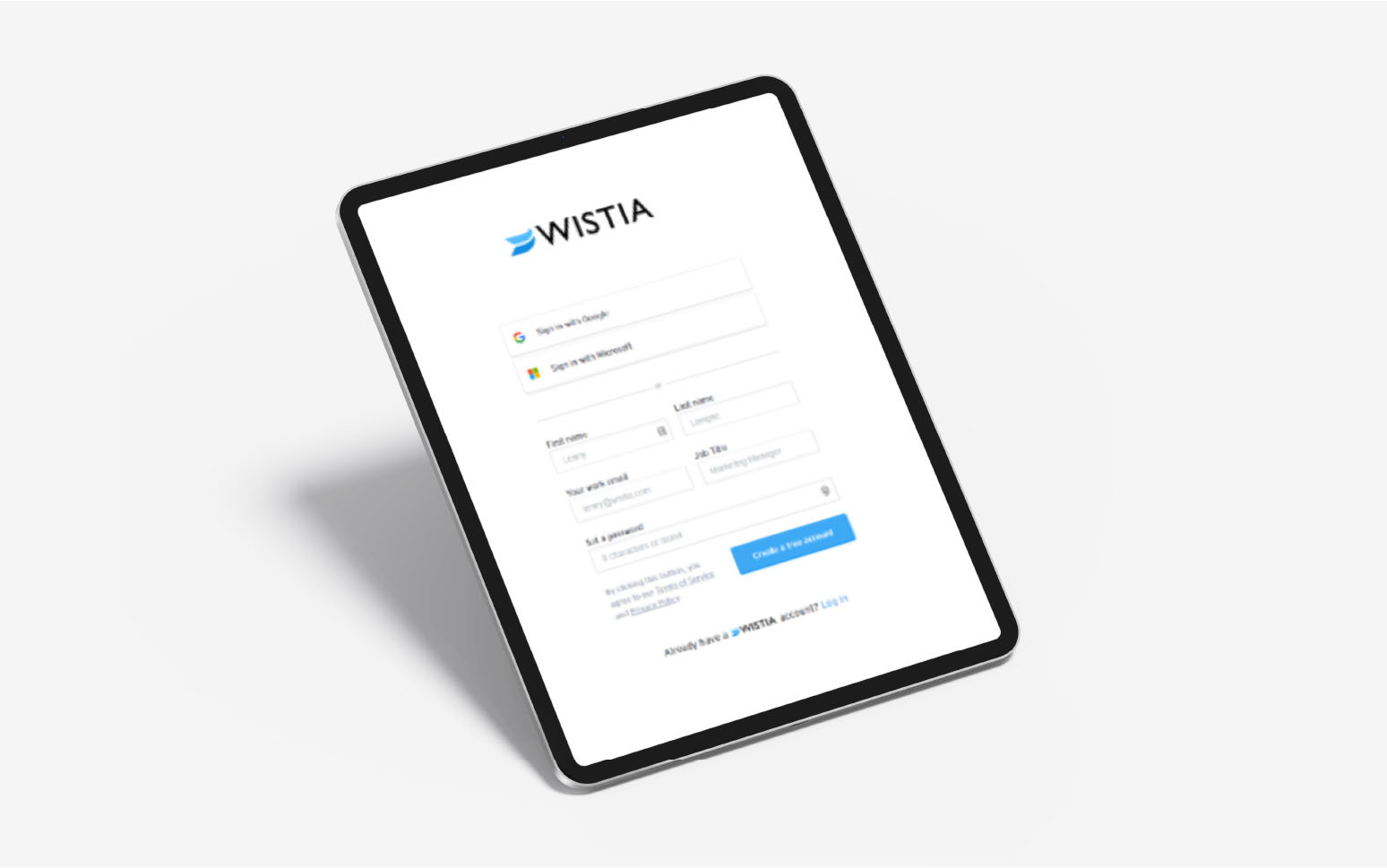
4. Wistia
Wistia’s landing page is one of the simplest on our lists of examples. There are no graphics to grab your attention, aside from the Wistia logo. The company instantly tells you what you need to do, assuming that you already have enough information from previous interactions.
To simplify the process of signing up, Wistia allows you to either enter your details on a small contact form or sign in with Google or Microsoft credentials. The CTA button highlights the “free” account offering, so you know you’re not taking a financial risk.
For those who have further questions, the second half of the page (below the fold) includes an FAQ. The team quickly answers questions like “are there any limits?” and “Is there a catch?” to put consumer minds at ease.
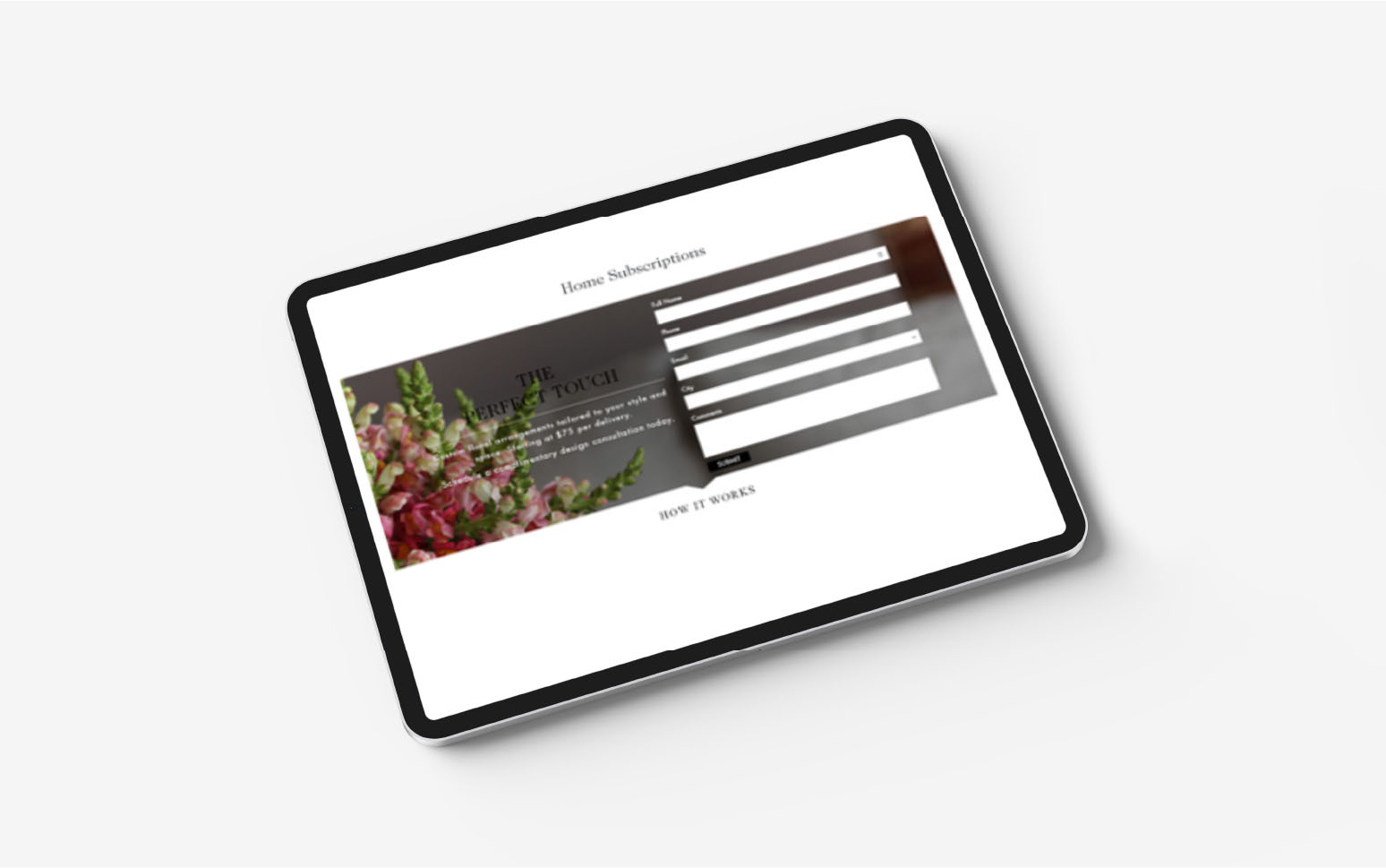
5. H. Bloom
The landing page from H. Bloom is an excellent example of how you can use your brand image to connect with your audience. The team reminds visitors of the professional nature of the business with high-quality photography and plenty of white space.
The above-the-fold form is excellent for conversions, and the company lets you know exactly what’s going to happen when you submit your information. If you’re still not sure that you’re ready to make a purchase, H. Bloom puts your mind at ease by showing how the process works in 3 simple steps.
While a full set of terms and conditions isn’t always necessary on a landing page, it can give your audience some peace of mind when you’re asking for a significant amount of cash or a subscription.
What about Social Media Landing Pages?
One last point to keep in mind when you’re creating landing page designs that convert is that they’re not just for search engine ads. Social media landing pages are growing increasingly popular in the age of Instagram and Facebook.
A social media landing page is the destination followers visit when clicking on a social campaign. Most social media landing pages are very straightforward. The aim is to prompt specific action with as little copy and content as possible. Your customers may be visiting your social media landing pages from a smartphone, so it’s essential to keep things simple.
Though you design social landing pages as part of a social media campaign, you don’t host the pages on Instagram, Facebook, or LinkedIn. The initial ad for your campaign is on social media, while you host the landing page on your website.
When designing social landing pages:
- Eliminate any extra weight: As of 2019, there were 3.46 billion social media users active on mobile. These customers don’t have time for lengthy, complex pages. A simple layout that’s easy to explore on a smaller device is crucial. Avoid any buttons, menus, or sidebars that will clutter the page.
- Make your brand clear: Like any landing page, your social media pages need to demonstrate the unique elements of your brand. Show your logo and brand colors to reassure customers that they’re in the right place.
- Be persuasive: Because landing pages have simple, clean designs, they only offer a few chances to make the right impression. Use a compelling headline and explicit, benefit-oriented content to grab customers' attention fast.
- Make it eye-catching: Just because your landing pages are simple doesn’t mean they need to be boring. Eye-catching graphics, videos, or pictures could convey more information, fast.
- Create a compelling CTA: Remember to let your audience know what you want them to do next. A button saying “Get Started” or “Start a free trial” is crucial.
Discover the Power of Landing Pages
A well-designed landing page guides your audience to a specific page at a crucial time in their purchasing journey. Knowing how to build these essential pages is a crucial step to increasing your conversions and unlocking new opportunities for your brand.
Remember, pay attention to the results that you get from every landing page effort on your site. Tracking metrics like click-through, conversion, and bounce rate, will help to optimize your future campaigns.
The more you learn from experimenting with your landing pages today, the easier it will be to ensure you’re speaking your audience’s language tomorrow.