Think of McDonalds, Coca-Cola, or Nike. What comes to mind? For most people, logos are the most memorable part of a brand identity.
The right image can dilute all the unique characteristics of a brand down into one component. Just look at how the arrow in the Amazon logo instantly evokes ideas of products ranging from A to B. Or how about the way that Target’s logo resembles a bullseye?
Karl Lagerfeld, the famous designer, once explained the importance of logos by noting that while people don’t always speak the same language, meaningful images are universal. The question is, how do you know you’re investing in an effective logo design strategy?
One mistake in the logo design process and you risk blending into the background with a sea of similar companies. Fortunately, this guide to logo design and development will set you on the right path.
Logo Design Cost: What Are You Really Paying For?
Effective logo design demands investment and there’s no one-size-fits-all pricing structure for logos. Nike paid around $35 for its logo, while BP paid around $211 million. The important thing to remember is that you should never try to design a logo on your own just to save cash.
Your logo is the heart of your visual brand identity. It needs to combine everything that makes you unique, while keeping your image simple. It’s not easy to design a logo that really makes an impact. The factors that influence logo design cost include:
- Agency or designer reputation: Some designers and companies have spent years building their reputation. These design pros know how to deliver results, and they’ve proven this through countless collaborations with meaningful companies. A company with a strong background may charge a little more.
- Demands and requirements: You may have specific needs for your logo. Some companies want multiple versions of the image. Others want a simplified logo that they can use for apps and smartphone icons.
- The process: If you approach your designer with a great design brief and plenty of information about your brand identity, they’ll need to do less of their own research to create a logo. Make the process simpler, and the price will be lower.
- Service elements: Different professionals charge for unique things. You may need to pay slightly more if you want multiple revisions of your logo. If you want a logo that’s animated, or available in different file formats, this may cost more.
The True Costs Of Effective Logo Design
Although paying for a professional to design a logo may seem more expensive at first, the reality is that you could save a lot of money.
Effective logo design isn’t something that just anyone can do. This process demands a lot of background knowledge and expertise. Logo experts have spent years studying different logo trends and discovering what works for different industries. If you don’t hire a professional, you lose cash on:
- Redesigning your logo multiple times to find something that works
- Rebranding your company when one image doesn’t drive the right response
- Missing out on customer affinity from people who don’t understand your logo
The logos you design yourself are also likely to be less professional than the ones created by an agency or expert. Professional designers use state-of-the-art software for effective logo design.
If you’re not willing to invest in similar tools and learn how to use them, there’s only so much you can achieve.
7 Logo Types With Examples
As any guide to logo design and development will confirm, there are various kinds of logo. Some logos showcase the name of the company, others are just an image.
To invest in effective logo design, you’ll need to know which kind of logo appeals most to you customers.
Monograms
Monograms or letter marks are a common choice among companies with longer names. You may not know much about the Home Box Office, but everyone’s heard of HBO.
Monograms leverage the initials in a company’s name to create an effective identity. Companies with longer names that might not roll off the tongue can gain instant recognition with these designs.
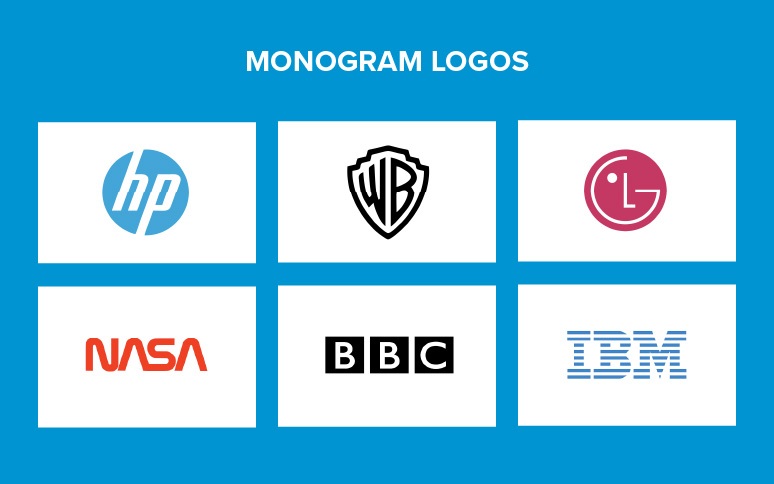
Since monogram logos are all about font, it’s important to ensure the typography is legible, attractive, and relevant to the company image. NASA uses a modern font to help you envision space travel. The As in the logo even look like arrows pointing up to the sky.
Monogram logos are best for: Companies that have longer names that aren’t very memorable on their own. Monograms make it easier to display your identity on your website, business cards, and apps. If you already have a short name that’s easy to remember, like GAP, you don’t need a monogram.
Wordmarks
Wordmarks are similar to monograms because they use typography to convey meaning through your brand name. Instead of using letters, wordmarks use the entire brand name, such as Google, or eBay. Through the use of color and carefully selected fonts, wordmarks convey meaning.
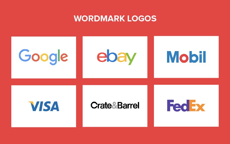
The Visa logo uses the color blue to demonstrate trust and credibility, combined with a golden yellow to represent money. The image is slightly slanted in a forward direction, demonstrating speed and simplicity. Wordmarks can have symbols hidden within them, like the arrow between the A and Z of amazon, or the arrow in FedEx.
Wordmark logos are best for: Companies using their names to define their business. If you have a meaningful brand name that you want your customers to remember, a wordmark will help. Wordmarks are also useful if there’s no obvious shape or image that would represent your brand.
Brand Marks
Brand marks or icons are image-focused logos.
If your brand identity sparks a vision of a specific image, an icon might be ideal for you. Twitter uses the image of a bird to convey short chirps of communication.
Companies may start with logos that include both an image and text. This was the case for Target and Apple. As the business becomes more recognizable, the image is often enough to represent the company alone.
If you choose a brand mark for your logo, be careful about what you choose. Some images will not be available to copyright, which makes it harder to protect your identity.
Brand marks are best for: Companies that can easily choose a graphic relating to their business. The apple image for Apple computers is an obvious choice, and something customers will universally recognize. If your image won’t convey the same meaning all around the world, you’ll struggle with a brand mark.
Abstract Marks
Brand marks, or pictorial marks, are a visual representation of a business name. Apple’s brandmark is an apple; Shell’s mark is a shell. Abstract marks rely on imagery, similar to a brand mark, but what they represent is less obvious.
Abstract marks can have meaning hidden beneath the surface, but you may need to look harder to find it. A good example of this is the Nike Swoosh. The checkmark-style icon might not seem to mean much at first, but it’s got a great deal of relevance under the surface. Because abstract marks are unique, they’re easier to copyright and protect. These marks are also extremely recognizable and difficult to replicate, though they’re harder to create too.
Abstract logos are best for: Companies like the idea of a visual icon, but don’t have a specific picture in mind. If you want to represent your business with an image, but you don’t want to be direct, then an abstract mark could be the right choice.
Crucially, while abstract marks can be more subtle in their meaning, they should still convey the same valuable information about your business. The Google Drive logo instantly makes you think of connected streams of information.
Mascots
Mascots are a little less common in logo design today. Originally, these designs brought entertainment and fun into a company’s image. For companies that want to appear as friendly and human, mascots are a great choice.
Because mascots have a more complex design than many logo marks, they can be tougher to use at scale. Things like the Michelin man are often simplified for websites and marketing campaigns.
Mascot logos are best for: Companies that want a more dynamic image. If you’re looking to create a unique connection with your customer, a mascot may help. You may find it difficult to spread your brand image with a mascot if you don’t simplify the design.
Emblems
Emblem logos are unique because they combine both words and imagery. The great thing about an Emblem is that it gives you more scope to convey meaning about your company. The BMW logo with its bold font and shield delivers ideas of luxury and protection.
Brand emblems may be tougher to use on smaller devices and screens. The wordmark is often contained within the image, so a reduction in size impacts clarity.
Emblem logos are best for: Companies that want a traditional image. Emblems remind us of coat of arms designs from history. These logos are great for delivering a lot of information about a business quickly. The scalability problem could mean that these designs aren’t ideal for digital companies with their own app.
Combination Marks
Combination marks are letter marks or word marks combined with pictures, mascots, or abstract marks. There aren’t any specific rules for how you have to combine the components of a combination mark.
Some people place the image above the font, like with Target’s logo. Other companies play with the connection between the image and the font, like Puma with its puma image jumping over the font.
Like an emblem, a combination mark is a great way to deliver a lot of information fast. Because combination marks are specific, they’re easier to trademark and protect. A combination of elements can convey a lot of meaning, and often allow for a more memorable design.
Your Guide To Logo Design And Development: The Design Process
Some logos look like they take minutes to make. The Nike logo at first glance is just a smooth checkmark to most people. Look closer and you’ll discover that the image is modelled after the wing of the Greek goddess Nike, the deity of victory.
Effective logo design, like most design projects, requires an effective process:
Logo Design Step 1: Creating The Brief
A creative brief is an essential tool you can use to brief your logo designer. These briefs outline your brand identity for any agency or professional you work with. Some experts will give you a brief worksheet to fill in, while others will ask you to gather information on your own.
The points to cover in your design brief may differ depending on who you work with, but most documents include:
- Brand guidelines: What does your brand stand for? What colors do you use? What do you do?
- Target audience: Who are you trying to reach? User personas are helpful here.
- Inspiration: What kind of logos do you already like?
- Requirements: What style of logo do you need? How many versions?
- Cautions: What would you like to avoid with this logo?
Logo Design Step 2: Conducting Research
A logo needs to be unique to be memorable.
Conducting competitor research will help you to see what’s already on the market. Good market research will give you insights into over-done trends that you may want to avoid. It also gives you an opportunity to see what’s already working for other brands.
Make a list of the competitor logos that you like and dislike. It’s helpful to include notes on the things that impact you. You might love minimalist logos, but dislike images that are entirely in black and white.
If you’re not sure what’s working in your industry right now, speak to your designer. They may be able to offer advice on the trends that are working, or how you can differentiate yourself.
Logo Design Step 3: The Ideation
After your designer has your brand identity information, and plenty of market data, you can begin to brainstorm. Many designers ask companies to help them with creating a mood board. This board might include shapes, graphics, and colors that seem to resonate with your brand.
For the Twitter brand, the mood board may have featured various shades of blue, and multiple bird pictures, along with some other ideas.
Working with a professional on a mood board can start sparking inspiration about the essential features that your logo needs to include.
It’s also worth connecting your mood board to a mind map. While the mood board covers images and colors, the mind map will list any words, feelings, or adjectives you want your brand to relate to.
For Twitter, the ideation process may have led to the following instructions:
- Coloring: Light blue
- Image: Simple or minimalist
- Shape: A bird
- Feelings: Friendly and agile
- Personality: Fun
Logo Design Step 4: Initial Designs
After a thorough discovery and research process between the designer and company, the design team can begin to sketch out ideas.
A logo designer will provide multiple versions of an initial logo, as it’s unlikely that anyone will come up with the perfect image first-time.
Some designers will start by sending very basic versions of your logo and ask you to pick the things that you like the most. You might love the shape of one logo but hate the typography.
The initial design stage allows you to mix and match components from multiple ideas to find something that best represents your brand identity.
Logo Design Step 5: Drafting
Once you pick the best designs and elements from all the initial sketches, your designer can embed them into vector graphics software.
This makes it easier for designers to manipulate and adjust images with more control than they’d have just drawing on a piece of paper.
In the initial drafting stages, your designer might give you a range of black and white versions of your logo, combined with colors that match your brand image.
During the drafting stage, designers may also combine elements together and present them separately. You might see a version of a wordmark underneath and beside a brand image.
Logo Design Step 6: Assessing The Options
Now it’s time for you, as the brand leader, to give feedback on the available designs.
It may be necessary to meet with shareholders during this stage or anyone who should have an impact on your design choices.
Print versions of the logo out and try resizing them to see what they’d look like in different circumstances. Many companies capable of effective logo design will show you an example of what your logo might look like on a business card or your product packaging.
This is your opportunity to ask for any adjustments you might need. There’s often a lot of communication in the design process where brands and designers discuss what might be possible with each image.
Logo Design Step 7: Delivery
Now, the designer will make any final changes to your logo and provide you with all the files you need to use that image.
If you have specific requirements for the kind of documents or files you need, make sure that you let your designer know in advance.
If you’re still not happy with some aspects of the logo, ask your designer what their policy is regarding revisions and updates.


