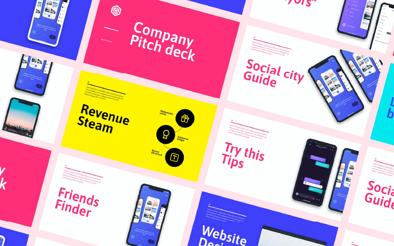
Companies need cash to survive.
A significant portion of that capital comes from your customers. The rest comes from like-minded individuals or groups who believe in your vision. To earn that kind of support, you need a way of sharing your dream with the right people. Enter the pitch deck.
Pitch deck design is a fundamental part of business growth and expansion. With the right deck, business leaders can show investors exactly what makes their company such a great investment.
As with most things in the branding and marketing world, it’s not just what you say that counts, but how you say it. The right deck will take your audience on a journey of discovery, from their initial introduction to your business, to their new position as official investor.
The Essential Elements Of Your Pitch Deck
Pitch decks are brief, but impactful presentations. They show your investors everything they need to know about your business. A good pitch deck isn’t just informative, it’s also inspirational. Good pitch decks will intrigue your investors enough to make them want to be a part of your vision.
Some of the most important sections to include in your pitch deck are:
Vision And Value Proposition
This is an overview of your company and the value you can offer to customers. Some pitch decks start with a single snappy phrase to encapsulate exactly what the brand does, such as “We’re the Netflix for music”.
The Problem You Solve
The best businesses thrive because they address an existing problem. One of your slides needs to be about the issue you’re going to address on the behalf of your customers. You can briefly touch on other solutions in the market, but only to establish how your offering is better.
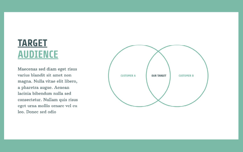
Target Market
Your investors need to know who’s going to be generating your revenue. Use this slide to showcase what your ideal customer looks like. It’s a good idea to have some basic statistics and market data if possible. If you’ve already conducted surveys of your intended customers, use this information too.
Your Solution
Finally, it’s time to look at your service or product. Describe how customers are going to use your product, and how it addresses the problems you’ve already outlined. You might be tempted to pull this slide to the front of your pitch deck. Introducing your problem first will generate a sense of intrigue in your audience which makes it easier to sell your final solution.
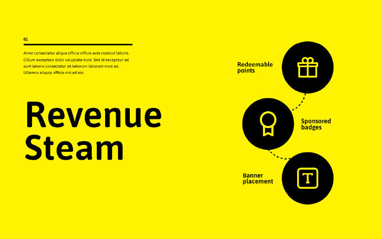
Revenue Model
Once you describe your product or service, you’ll need to address how it’s going to make money. What kind of prices are you charging, and in what structure? Do you have subscriptions, or allow people to pay as they go? Reference the competitive landscape to demonstrate how your strategy fits into a wider market.
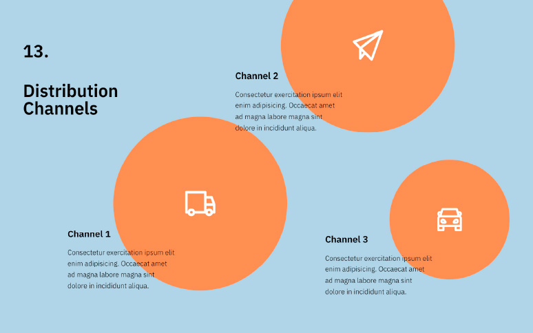
Sales And Marketing Strategy
How are you going to get your customer’s attention about your solution or services. Use this slide to highlight your marketing and sales plan. You might use examples of social media posts and blogs you’re planning on posting to gain online attention. Discuss things like word of mouth and loyalty plans too.
Traction/ Validation Roadmap
If you already have early adopters using your products, or sales, this is the time to talk about them. Investor’s love seeing proof that your business really does or will make money. In this slide, talk about your milestones, and how you’re going to measure success over time.
People
Who are the individuals helping you to reach your goals? Do you already have key professionals working for you, like CFOs and marketing experts? How about a branding team to bring your business to life?
Financials
The financials slide talks about your current income, your sales forecast, and how you plan on using any investment you get. This is the time to demonstrate that even if you’re not making a lot of money right now, you know what it’s going to take to earn that cash in the long-term.
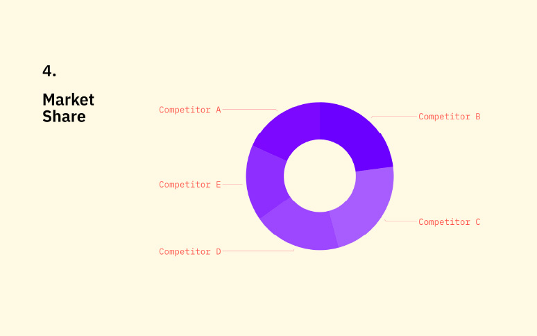
Competition
Who are you going to be fighting against to attract and serve your audience? Every business has competition to consider in one form or another. Even if you’re moving into an entirely new market, your customers are probably using some kind of solution to address their problems. Show how your offering is better.
Depending on your business, you may also use slides in your pitch deck to demonstrate your “exit strategy”, or what you’re going to do with your business long-term. If you have existing strategic partnerships or investors, it’s important to showcase these too.
How To Create A Pitch Deck That Earns Funding
Approaching investors is serious business. Some Series A start-ups spend around $400k a month bringing their business to life. To earn that kind of cash, you need the perfect blend of informative and emotional impact.
Construct A Storyline
Learning how to structure a pitch deck isn’t just about getting the formatting right, you also need to follow the right storyline. Outlining a successful pitch deck means addressing all the key points in an informative story, from the “why” of your business, to the “who” of your target audience.
A good pitch deck will introduce your company, audience, competitors, and even the problem you’re facing, before you showcase the solution (your product).
Keep The Right Perspectives In Mind
Writing a pitch deck is just like creating any marketing campaign. You need to know your audience. There are three main perspectives to keep in mind for your pitch deck: the consumer, investor, and entrepreneur. The best businesses start with the customer in mind – what’s the problem they face, and who are they?
Next, you highlight the benefits of your business offering to the entrepreneur and demonstrate your vision as an entrepreneur.

Get The Wording Right
Boring, dry language has no place in a pitch deck. Focus on utilizing powerful phrases like “best” and “proven” to intrigue possible investors. Walk the line between exciting content, and hyperbole statements, like “the best in the world”.
When you do make positive statements about your brand, ensure you can back them up. How can you prove that you have the “best customer service” in New York?
Know Your Formatting
Your pitch deck design plays an essential role in creating a positive first impression with your possible investors. You might have some great ideas and visuals, but if your pitch deck doesn’t look right, your investors will see you as unprofessional.
When formatting your pitch deck, balance words with outstanding visuals. Too many words in any slide can overwhelm your audience. Your investors don’t want to sit silently reading blocks of text – they want you to present your idea in a dynamic way.

Show Your Metrics
Statistics, measurements, and metrics are all clear proof of why your business is worth an investment. While everyone loves a great story or idea, your investors also need evidence that your company isn’t going to waste the money they offer.
Your slides should show as many metrics and useful pieces of statistical information as possible. If you can, arrange this information into visual assets, like graphs and charts. Visual representations of data are often easier to understand.
Keep It Simple
When you’re writing a presentation about something you’re passionate about, it’s easy to get carried away and start waffling on. Overly complex language and long pitch decks may mean that you lose the attention and focus of your audience.
Get straight to the point with every slide. This means starting with a showcase of the kind of problem you’re going to solve – complete with evidence of the issue. Draw on background stories and anecdotes from time to time if they make your information more believable.
Make Your Solution Seem Perfect
Showing your investors, the problem you recognize is a good start, but you also need to highlight your solutions. Why is your offering going to fix these issues for your customers? What makes the idea better than whatever your customers currently have to overcome their issues?
Showing demo slides of your product, pictures, and even case study quotes from previous customers is an excellent way to make your solution stand out.

4 Pitch Deck Design Tips
Your pitch deck needs to show the benefits of your company and product in a way that’s easy to consume and straightforward. An engaging pitch deck communicates your message in a visual, dynamic, and highly engaging way.
Avoid Common Design Mistakes
The best pitch deck design should communicate your message clearly and easily. The wrong design can obstruct what you’re trying to say. Watch out for mistakes like:
- No visual hierarchy: Your pitch deck should naturally draw your audience from one page to the next, with easy-to-read and consume points.
- The wrong colors: Pitch deck colors should link to your brand colors and be used in a way that pulls attention to the most valuable points in your message.
- Illegible fonts: The typography you choose needs to be easy to read – even from a distance. Use a clear font type and a larger size to ensure your message is clear. Font choices should also align with your brand identity.
- No whitespace: As tempting as it is to use every inch of space on your decks, remember that white space between design elements makes them easier to read.
Minimalistic, but value-rich designs are often the best choice. Your pitch deck should look clean, professional, and as straightforward as possible.
Visualize The Data
The best pitch deck examples have lots of data displayed in an easily consumable format. Although statistics and data are excellent for your pitch deck, they can also be difficult to showcase in a slideshow format. Numbers are much easier to get a grip on when they’re in the form of graphs and charts.
Experiment with different kinds of visualizations to make your numbers stand out. Your pitch deck design will work best when created according to the investor’s preferences. If you’re a B2B company, line and graph charts are likely to look more professional than pie charts and animations.
Combine Information And Emotion
Logic is crucial in pitch deck design. The right information convinces your investors they’re making a solid financial decision by investing in you. Decisions are made on a combination of logic and emotion. This means that you need to connect with your investors on an emotional level too.
Storytelling tactics, like discussing experiences you’ve had with customers so far, or exploring what might have led you to creating this service or product, can get your investors emotionally connected to your brand. It’s the emotional connection that tips people over the edge when they’re trying to decide whether to spend money.
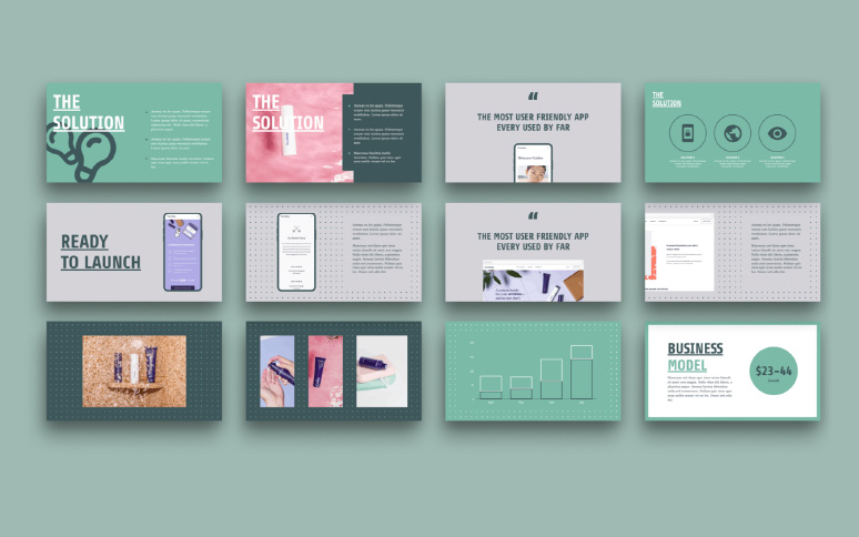
Align Your Pitch Deck To Your Branding
Look at some of the world’s leading pitch deck examples, and you’ll notice most are made in the company’s brand colors, often with logos and brand names in various places. A consistent brand image makes your idea more memorable, so ensure your deck aligns to your image.
A branding and design company can help you build a pitch deck that not only demonstrates your brand but conveys your idea in a way that’s both visually and emotionally engaging. Some branding professionals even create templates for brands so they can re-create pitch decks as often as they like.
6 Pitch Deck Examples To Inspire You
Still not sure where to start with pitch deck design? Here are some great examples to inspire you.
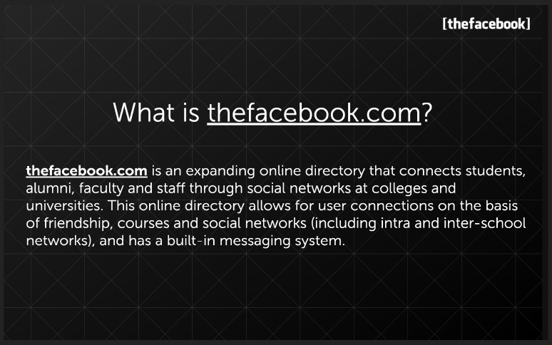
The original pitch deck from Facebook might look a little outdated now, but it’s an excellent example of the company’s vision and branding. Mark Zuckerberg created his pitch deck from a dorm room, but it still contains all the information investors need, from key metrics to the company’s value proposition, and any marketing services in use.
Airbnb
Airbnb has one of the best examples of a pitch deck in the world. The information is fun and colorful – just like the innovative business idea. The company also gets straight to the point by showing facts about the number of trips people generally book each year. One of the best things about this pitch deck is the engaging intro. Airbnb immediately highlights the problem customers face and creates a story to engage the investor.
Buffer
Buffer rose half a million dollars in investment with this pitch deck – so you know it’s good. Though quite short compared to some pitch deck examples, Buffer gets straight to the point with an introduction to what they do, and how they can help customers. The deck includes quotes from social media market leaders, as well as key statistics and facts. Like many of the top pitch decks, Buffer’s is created on solid facts and insights, which makes it seem more professional.
LinkedIn currently stands as the world’s favorite social media environment for businesses and businesspeople. It all started with a series of successful marketing campaigns and pitch decks. Their pitch deck talked about the company’s value, how important it is to network in the business world, and how LinkedIn will be different from other solutions. LinkedIn is excellent at using analogy and interesting wording to show their investors what the company is all about.

Moz
When Moz was still a SEO company, it created a pitch deck to demonstrate its idea to investors. The deck immediately starts with an introduction to the company, and what makes it valuable to customers and investors alike. The information is engaging, but also emotional, referencing a “Mom and Son” consultancy, as well as numbers like “$1 billion company”. Because the company had already been in operation by the time this deck went out, it had plenty of data to offer during the pitch.
Sequoia Capital
One of the leading investment firms from silicon valley, Sequoia capital used its pitch deck to show investors what it could do, and how they could be a part of a financial revolution. This pitch deck features the colors of the brand, as well as plenty of valuable information about how the company has grown up to the point of asking for investment. Though you can’t see the official deck online today, the capital firm raised almost $1 billion with the right decks, and also has its own template online for entrepreneurs to use.
Creating Your Pitch Deck
The best pitch decks in the world are beautiful, concise, and ideal for getting people both emotionally, and financially invested in a company. The right deck will both elevate your company’s vision, and make sure that you can convince investors to pay attention.
While words and statistics describe what you can do, design is the element that keeps eyes on the page and pushes people to keep wanting to learn more about your audience.
When the stakes are that high, it is crucial that your final presentation flawlessly showcases your business potential. And you’re not going to do that with ugly slides. Your big ideas require a team of pitch deck design experts that will help you grab funding. Get in touch with us today.


