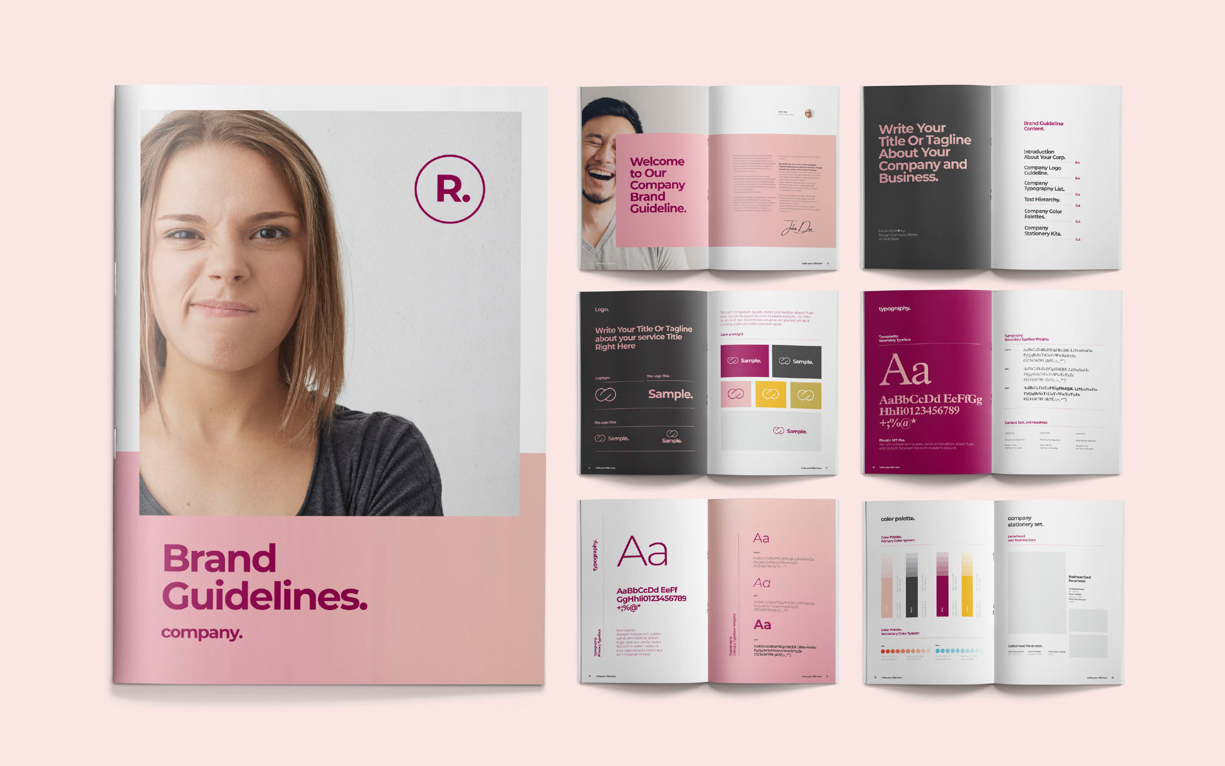
A consistent image is the key to a successful brand.
It’s how your customers identify you and set you apart from the competition.
A visual style guide takes the heart and soul of your company and translates it into something that people can see. The right visual elements say a lot about your business and what it stands for – but they also play an essential role in building a relationship with your customers.
Imagine if you saw a can of Coca-Cola without the iconic red color and cursive font. You wouldn’t be sure whether you could trust it was the real thing.
The visual rules in your brand guidelines transform your company into something that your customers can recognize on-sight.
What Is A Visual Style Guide?
A style guide is a crucial tool in developing a memorable brand identity.
This handy document tells every marketing team or content creator you work with what your business should look like. With a visual style guide, you ensure that you’re always presenting your company's same image.
Brands thrive on consistency. Studies show that people view brands as the personification of a company. If your company’s style or personality is constantly changing, your customers won’t know what to expect. By presenting the same image in every email, marketing campaign, and piece of product packaging, you create familiarity with your customer.
Eventually, that familiarity turns into trust and loyalty.
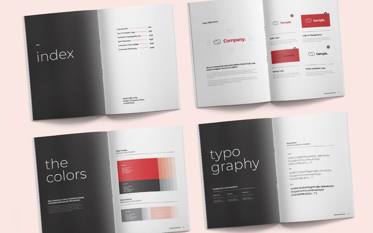
How Is A Visual Style Guide Different From Your Brand Guidelines?
Your brand guidelines are a complete overview of your brand’s identity.
This document will contain everything a person needs to know about your brand, from its tone of voice in marketing messages, to what your target audience looks like.
A visual style guide is just one element of your brand guidelines that focuses exclusively on image. Visual guides show how elements of your business should look, with insights into things like typography choices, brand colors, and logos.
What’s In A Visual Style Guide?
The rules for graphic style guides typically include applications and variations of the logo, design standards in terms of look and feel, corporate color palettes, white space usage and typography details among others.
Your Logo
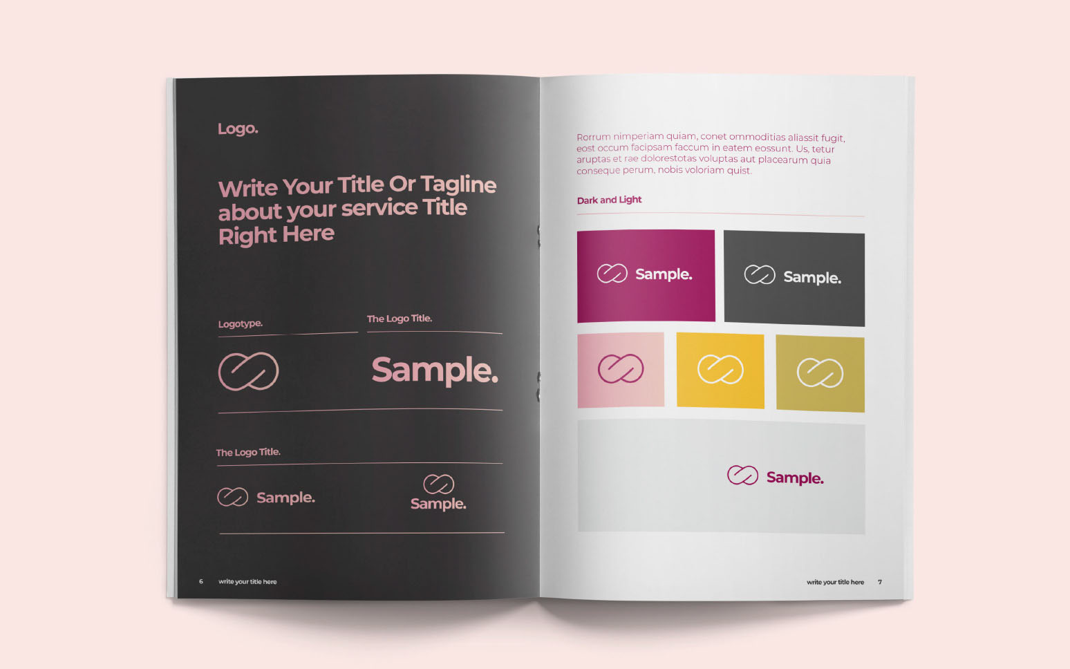
The logo is the most important visual representation of your brand. It’s how your audience will recognize your products and services instantly. Your visual guide needs to contain all of the vital information about your logo, including its minimum size, it’s size about other assets (such as taglines), and it’s color formats.
If you have derivatives of your logo in the form of app buttons or watermarks, include details for these too. Your logo guidelines will include:
- Size: Proper proportions and minimum size
- Space: How much white space is required around the design?
- Colors: Show all variations including black/and white and when to use them
Provide information on how you don’t want your logo to be used too, such as on certain products or in different shades.
Color Choices
Your brand colors make a huge difference to how customers feel about you. Color psychology reveals that we react emotionally to color. Including a set of brand colors in your visual style guide will ensure that you have the same emotional impact on your audience at every touchpoint.
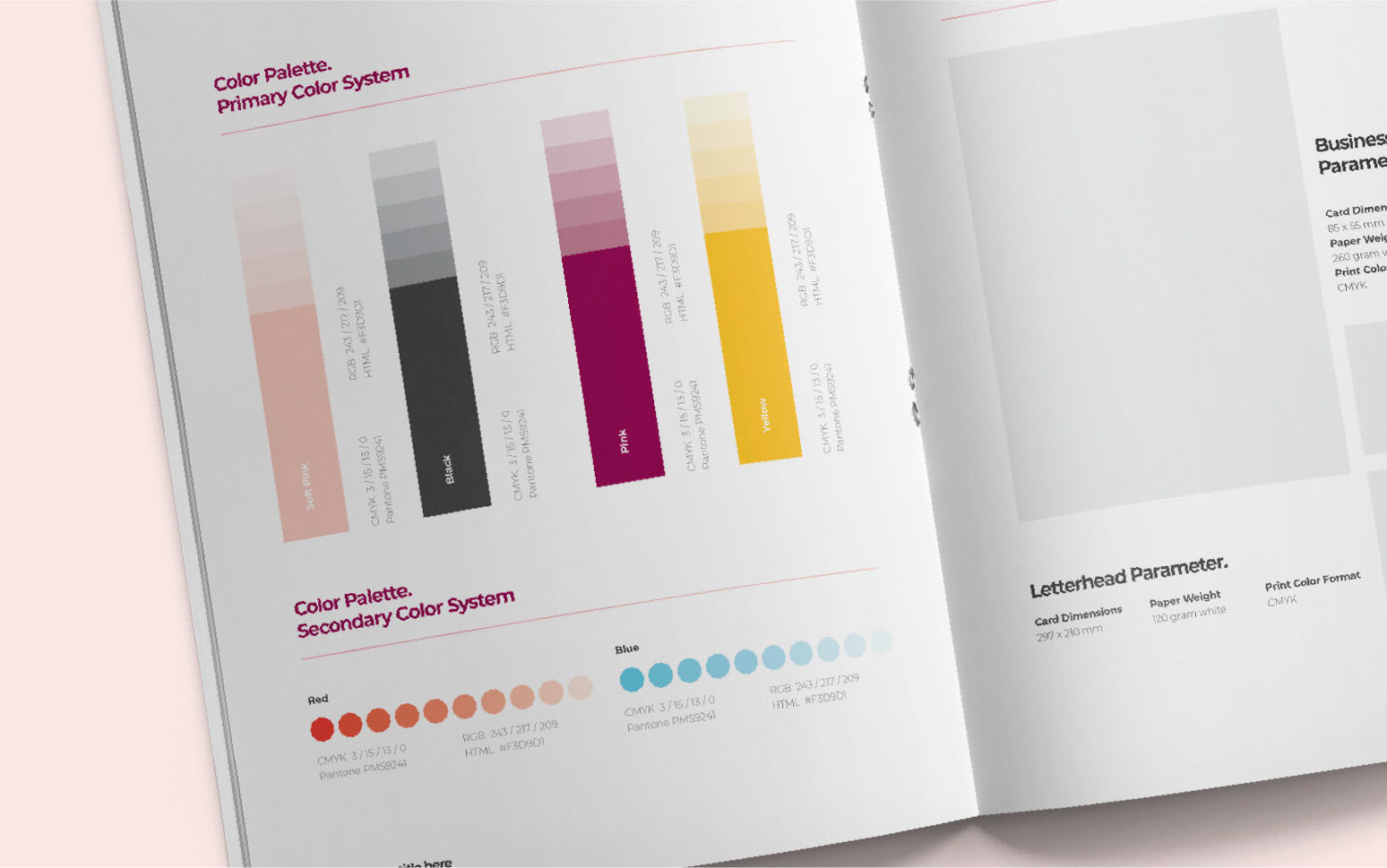
Include HTML color codes for each shade you want to use. It’s best to stick with just a handful of colors (4 or 5) to avoid overwhelming your audience. To ensure that your brand guidelines are complete, include the following information in your “color” section:
- Pantone color match name and number
- Print colors (CMYK)
- Digital colors with HEX and RGB codes
Typefaces
Any typefaces used within your logo, packaging choices, or marketing materials need to go into your style guide. Companies use all kinds of fonts to represent their business. You’re probably familiar with the iconic “F” on the Facebook logo, and the easy-to-read font that Google uses.
Distinguish between the fonts you use for body copy and titles when creating your brand guidelines, and don’t use too many different fonts. Most companies stick with no more than 3 or 4 fonts for all of their assets. Make sure every typeface you use is easy to read and web-safe.
Some companies include writing samples in their brand guidelines to make font choices easier. In your guidelines, outline:
- When/How: What is each typeface for? Headlines, body text, captions, logo, etc.
- Alignment: Should this font be in the middle of the page? Pushed to the left, or right?
- Spacing: Kerning and tracking ratios keep your style consistent when you change the size of your font.
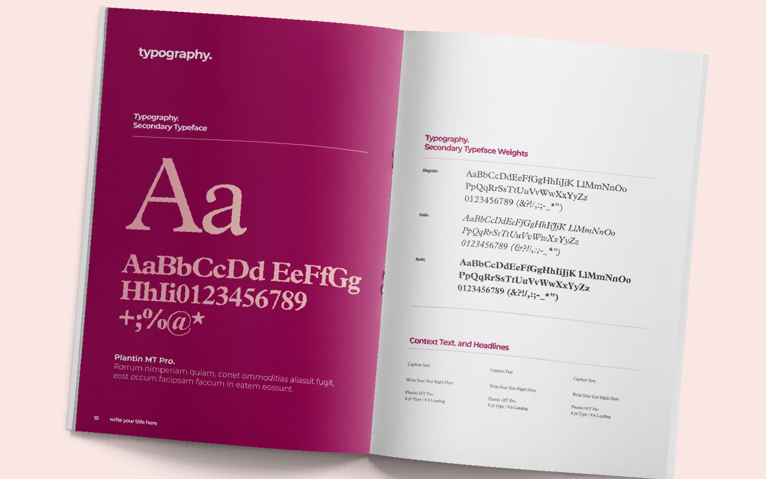
Image Guidelines
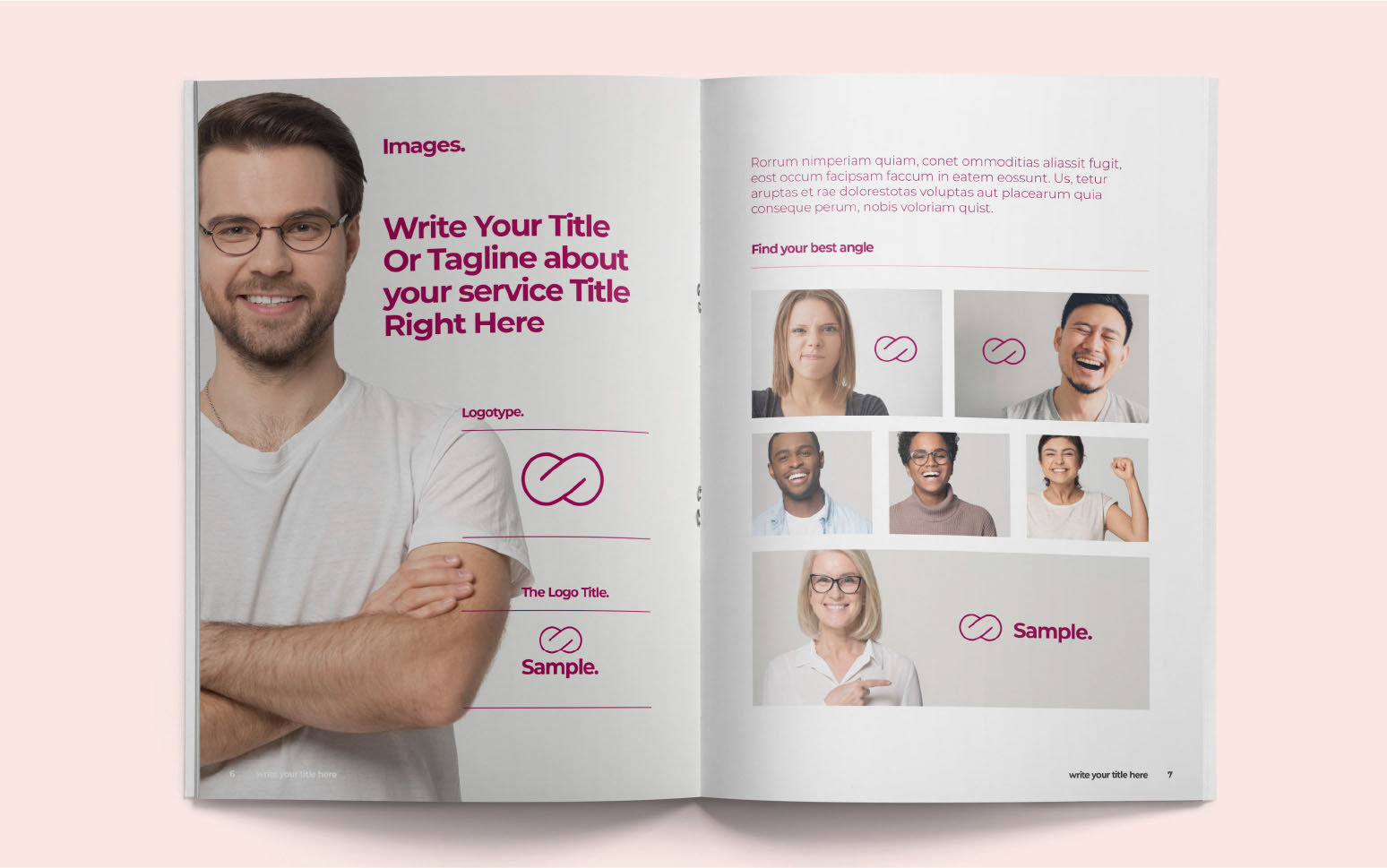
Some photos and illustrations will fit more naturally with your brand than others. Include examples of images that you would use for your marketing materials in your visual style guide. You might notice that Google uses a lot of illustrations with its branding. Illustrations are a great way to make companies seem more informal and approachable. It might be worth considering animations and pictures if you’re running a tech company.
Companies like Lush.com are always using authentic photographs. If you know that the sight of other human beings will make your customers feel more comfortable with your company, stick to photos.
If you don’t have all the images you need, pull examples from other brands that you like for your company. You may decide that all your images should be playful and hand-drawn, while another company might prefer authentic, human photographs.
In your style guidelines, show:
- Best practices: Offer examples of images that work well for your brand’s reputation. Are there any rules you follow, like every blog picture being a specific resolution?
- Context: How do you want your customers to feel when they see your photos or pictures? Including information about your brand personality will help designers to make choices.
- Restrictions: What kind of images should you never use? How will you ensure that you have the legal rights to all the pictures you access?
Other Visual Elements
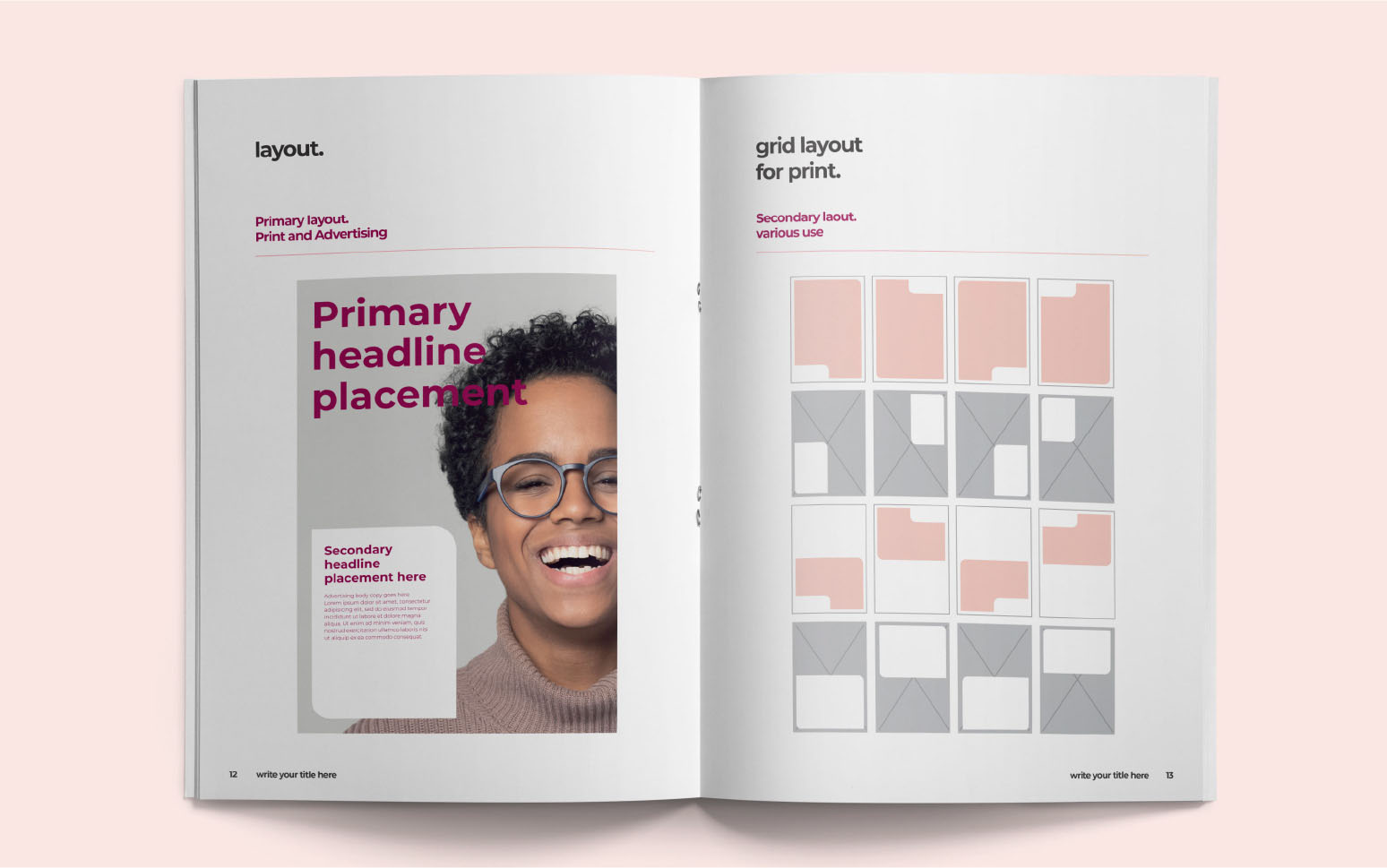
Anything else that would help a designer capture your visual essence is helpful in a style guide. Ask yourself what a designer might need if they were going to create a campaign for your company from scratch?
Templates for your blog layouts or a specific email format that you use to communicate with customers are both helpful. Shapes commonly used in your marketing materials, or filters for social media might fall into this document too. You can also list any colors or styles you want to avoid.
If your brand uses many digital assets, you might have to codify how certain elements should appear on your website.
Is your header picture for blog posts always a specific size? Do you always include pictures every couple of paragraphs in an article? When you create an infographic, how do you know how long it should be?
These documents align with content style guides and other tools to demonstrate how your business looks, what it sounds like, what it does, and how it should make people feel.
What Does A Visual Style Guide Do For Your Brand?
A visual style guide communicates your design expectations to your team and the people that you work with. Having this document to reference ensures that you can stay on track with every marketing campaign and new product design. It also means that you can help any developers or designers you work with to stick to your preferred image.
When you create a style guide, you do so with an in-depth picture of your audience in mind. Every choice you make, from font through to color will have a specific impact on your target audience.
Blue is the world’s favorite color, and it’s often associated with trustworthiness. Using blue in your brand colors could be a great choice for a company that needs to generate credibility. Red is a bold color, but it can also seem dangerous in the wrong situations.
A cursive font shows creativity and informality. That makes it a great choice for a company that wants to come across as innovative and playful.
Companies hoping for a sophisticated image might go for a Serif font like Times New Roman.
Referencing a brand visual style guide ensures that all of your content and brand assets set you apart from your competitors and give you a cohesive image.
5 Reasons You Need A Visual Style Guide
Some of the biggest companies in the world, like Skype, and Trello, publish their brand guidelines publicly so that employees, clients, and designers can access them whenever they choose. The right documentation makes your company more transparent and ensures that you never lose track of the image you’re trying to create. Visual style guides:
1. Create Confidence In Your Business
Certain assets make your business look more professional. Having a good set of brand guidelines is like having a well-designed website. It shows your audience that you’re invested in creating a consistent brand. Because these guidelines keep your business on track, they also reduce the risk that you’ll send inconsistent messages to your audience. A consistent brand image creates a more trustworthy and believable brand. Think about how Apple fans instantly trust Apple branded products.2. Improve Brand Recognition
Your customers should be able to recognize your business instantly whenever they see a set of colors or a specific logo. Your brand guidelines ensure that your customers know what content and marketing campaigns they should attribute to your business. Recognition for brands often evolves into familiarity over time, which eventually creates customer loyalty and trust.3. Simplify Asset Building
Companies are constantly creating new assets in the form of marketing campaigns, social media pages, and email messages. A set of visual style guide instructions makes the creation process easier. You have a clear set of rules to follow whenever you’re designing something new. You also get a handy document you can share with professional designers and content creators.4. Improve Company Culture
Companies thrive better when everyone on your business is operating on the same page. A set of clear guidelines shows your employees what kind of image you’re trying to build for your business. This means that everyone on your team will know what your business stands for. Guidelines keep your team from getting the wrong impression and confusing your audience in the process.5. Give You A Compass
Your visual style guidelines are also an excellent reminder to you of what you build your business to be. As your company evolves and new trends emerge in web design and marketing, it’s easy to get caught up in new ideas. Your brand guidelines remind you of which strategies fit with your existing style and personality so that you can stay consistent.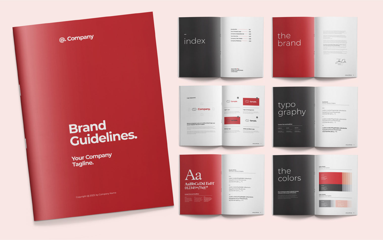
How Do You Make A Visual Style Guide?
The best way to create a comprehensive visual style guide is to work with a team of design professionals. These experts can give you templates to fill out which reduce the amount of work you need to do to define your brand.
Before you get expert support, there are a few steps you can take to improve your chances of success.
Step 1: Know Your Brand Story
It’s tough to create a set of style rules for your brand if you don’t know enough about the company to begin with. Every business has a specific mission and purpose driving it. With that in mind, think about what your company stands for, and what you want to achieve with it. Aside from making money, what’s the “why” that prompted you to create this venture in the first place?
Atlassian, a popular software company, made its brand story all about helping people to complete complex tasks in a fun and practical way. The team’s light-hearted and optimistic approach to business makes it stand out from a crowd of complex software providers.
Step 2: Know Your Audience
Building a successful brand image is how you ensure that you’re having the right impact on your audience. You want your customers to see your logo and immediately know they’re dealing with a trustworthy and reliable company.
The only way to ensure that you’re having a positive impression on your customers is to get to know them. If you’re starting a new company from scratch, do some brand research. Find out who your competitors are based on what you want to sell, then learn as much as you can about their audience. What kind of age-range are they in, and where do they come from?
Knowing your audience will help you to make important decisions about your brand image. While emojis, illustrations, and bright colors might appeal to younger audiences, they won’t be as effective on a sophisticated B2B audience.
Step 3: Decide On Your Dealbreakers
Certain aspects of your brand identity will change naturally over time. As your business evolves, and visual trends change, your image will update too. Look at how much Google’s logo has changed over the years as style preferences have moved into a more “minimalist” vibe.
Your brand guidelines are there to guide your team and anyone you work with, ensuring that your visual identity stays consistent. But these guidelines aren’t set in stone. They should have some freedom to adapt over the years.
To make sure that your guidelines can grow naturally over time, without risking the loss of your brand essence, make a list of deal-breakers that matter to your company. You might decide that you never want to use stock photos in your marketing campaigns because this would detract from your company’s authenticity. Do you always want to keep one of your brand colors the same, even if others change? It’s up to you.
Step 4: Approach The Professionals
Once you have the basic information you need about your business and your audience to start creating your visual guidelines, speak to a professional team. Take your time to find a design company that you can trust. The right business will take the time to get to know your brand before jumping into action. It’s also worth choosing a venture with plenty of examples of previous work.
Make sure you let them know what you’re trying to accomplish with these documents, and what you want to cover.
Some companies have huge sets of brand guidelines that cover everything from how to post photos on social media, to what kind of language teams should use in blog posts. Other companies start small, by outlining information about their brand colors, typography, and logo, before adding extra information later.
Let your professionals know what you want to do and let them guide you through the process of building a consistent brand.
Do You Have Your Visual Brand Guidelines Yet?
A visual style guide is just one component of your wider brand rules – but it’s one you can’t afford to ignore. Most customers still make assumptions about companies the moment they see their logo or website. Having a set of visual guidelines in place will ensure that you always make the right impact.


